Quantcast
Channel: Countertops Archives - Retro Renovation
Viewing all 61 articles
Browse latest View live

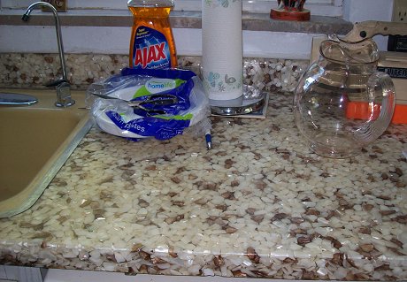
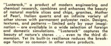
Lusterock kitchen counter tops — readers share stories about this interesting 1960s material

$
0
0

One of the coolest aspects of this blog is that one reader will send us photos of something unusual that they own or have encountered — perhaps an original feature of their home, a specimen of steel kitchen cabinet or an interesting light. We may not know about the object — and all internet searches will be for naught — but then we post the question and BLAMMO — our knowledgeable readers will leave comments filled with valuable tidbits of information, personal stories involving the item in question and even identify the woddity — solving the mystery. This is exactly what happened with our post about about a vintage kitchen counter top embedded with quartz chips — which is still getting clicks after over two years. What was it made of?  You vigorously responded: Lusterock. Yes — thanks to our readers — who have help to solve yet another mystery about the vintage treasures in our jewel box mid century houses. Read on to learn more about this interesting material –>
lusterock-countertop

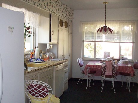
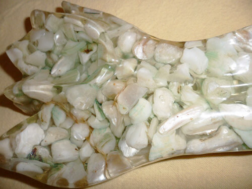
lusterock-kitchen-counterAfter Pam posted the photos above of reader Becky’s unusual counter tops, the comments started to pour in. Several readers had personal encounters with this inventive material.
lusterock-detail

Stephanie was the first to pipe up with a name:

My parents have these counter tops in their kitchen….they remodeled the kitchen in the 1970s…I believe it’s called Luster Rock…they get lots of comments on it…some good some bad…..I didn’t like it!! Ha Ha

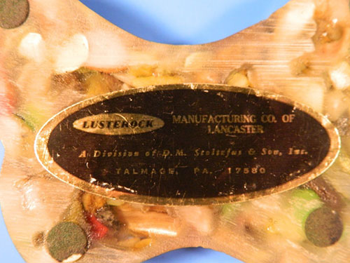
lusterock-spoon-rest-label

Spoon rest for sale on etsy.com shows the Lusterock label

Chris came along next (albeit both he and Stephanie provided incorrect spellings; we’re not being critical, we just want everyone to notice and use the correct spelling from here on, same as it’s “hudee rings“, not huddee rings.) :

It’s definitely Luster Rock, we had it in our house, (just finished remodeling and replaced it with boomerang counter top!). My friends dad was an installer in the 60s and said the stuff was indestructible, which I can attest to. I did everything to it and it always looked the same. I saved some of it to try to make a bar top for summer entertaining. Mine had more brown chips to it, and my problem was finding wall colors to work with it.

Still other readers knew people who had worked to fabricate, sell or install Lusterock, such as reader Delores who said:

Yes, it is called luster rock. My mom’s neighbors in Los Angeles ran a small business out of an El Sereno warehouse where they made these counter tops. They also subcontracted through Sears until I believe it became against the law to obtain shell in these quantities for these purposes. My mom sold her 1924 home in 2005, and the kitchen was done in the yellowish white lusterock. Two houses to the right is where the luster rock couple still live and their 2 story home including, kitchen and bathrooms were beautiful in the best of their work and luster rock. The house in between belonged to the wife’s brother (was a wrought iron artist) and that house was also complete with luster rock counter tops. We are selling some unique pieces (stereo unit and curio iron stands) that were made by brother and the tops are luster rock – white yellow and a long piece made with a bluish lavender shell that looks like carnival glass. Wonder what they are really worth…. they have kept their luster and beauty.
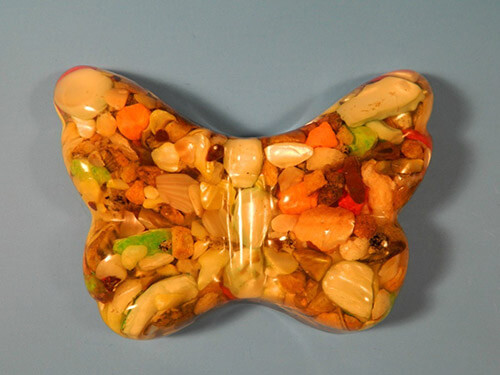
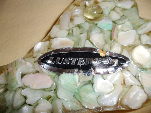
Lusterock-butterfly-paperweight

Lusterock paperweight currently for sale on ebay here

Linda reports that her stepfather worked with Lusterock:

My stepfather made and sold that in Arlington VA back in the 60s and 70s. I remember that he had to go away someplace to learn how to do it and buy the rights (I guess it was a franchise type of thing.) They used real rocks and shells, even fossil shark’s teeth and coins. Their house was full of it – they made shower stalls, sinks, counter tops, floors, paper weights – you name it they made it. I do not know why they stopped making it. It was beautiful then and it still is beautiful now. Probably found out it was really toxic or something – or like someone above said maybe it was illegal to get the shells in such quantity. But they used a lot of rocks, and it doesn’t make sense that it would be illegal to get rocks!

lusterock-label

Label from paperweight that is for sale on ebay

Then there were the readers who have fallen in love with this unique material — having fond memories of their past experiences with Lusterock or living in homes with Lusterock to this day.  Jackie has lived with her Lusterock counter tops since 1968 and reports:

We built our house in 1968 and put it Luster Rock counters. The have bits of shells and mother of pearl in an almond-colored acrylic. They have very few scratches and have kept their beauty for 42 years. I wouldn’t think of putting in new ones. It’s too bad they are no longer available.

Gayle added:

My friend’s parents’ house had the same counters. Her dad was a pharmacist and the counters in the back of his drugstore where he worked were made of the same resin but instead of rocks and pebble-like things, it was filled with all kinds of different pills. I was always fascinated with their counters at home and the store. Her parents had them both specially made.

Oooooh, a Lusterock counter top of pharmacist’s pills! We’d love to get hold of a photo of that curiousity!

And finally reader Ro added his happy memories — of his grandparents’ toilet seat! It happens! :) :

My grandparents’ house in Orange County, CA was built in the ’60s and one of the bathrooms had a counter top and matching toilet seat that were made of clear resin with embedded abalone shell. It was absolutely stunning. The embedded pieces of shell were numerous and had the full range of rainbow colored shine that abalone shell is known for. There were also little flecks of gold “sand” inside the resin. It was gorgeous, the whole thing was so captivating. You felt like you were swimming in the sea when you were in that bathroom. I have such fond memories of that counter top & toilet seat, as silly as it sounds, because they were just so unique and beautiful, despite having a somewhat dated feel when I would visit them in the 80s. I was just googling to find an abalone shell counter top or toilet seat like the one they had, but I haven’t found an exact match. None of them ones I’m seeing online measure up to how beautiful theirs was.

Who’da thunk it: All the (mostly) happy memories of Lusterock. Moreover, it’s so great to post these curiosities — and have so many readers pipe up to identify them, and tell their stories.

Special thanks goes out to Ebay seller mikeingreensboro for granting us permission to feature the photos of his vintage Lusterock informational post card… to ebay seller Dr. Von for allowing us to use his vintage Lusterock butterfly paperweight photos… and to Etsy seller Treasures2Share for allowing us to use photos of their vintage Lusterock spoon rest.

The post Lusterock kitchen counter tops — readers share stories about this interesting 1960s material appeared first on Retro Renovation.

Linen laminate counter tops, another mid century favorite

$
0
0

linen laminate counter tops

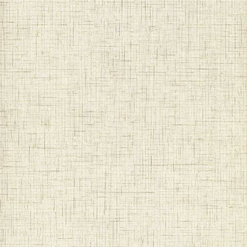
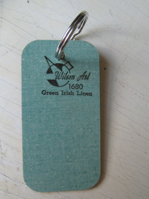
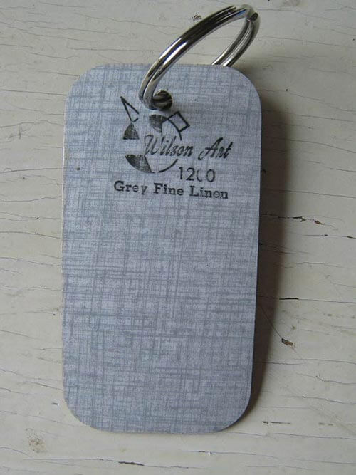
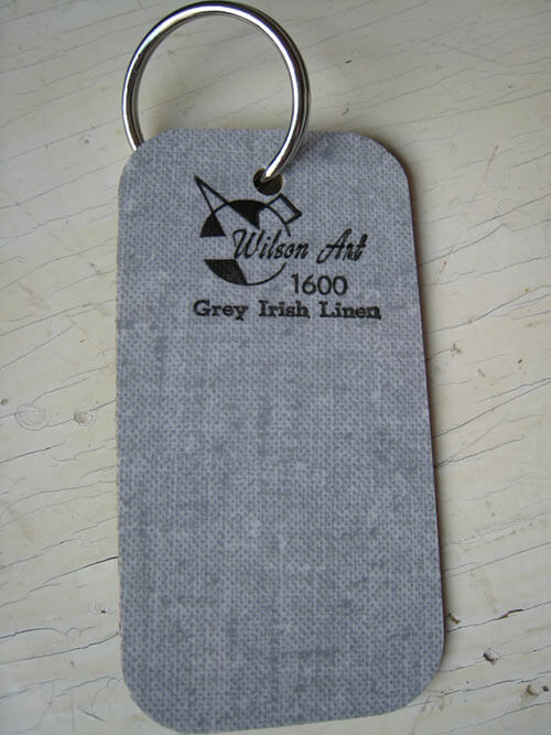
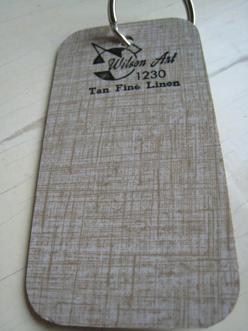
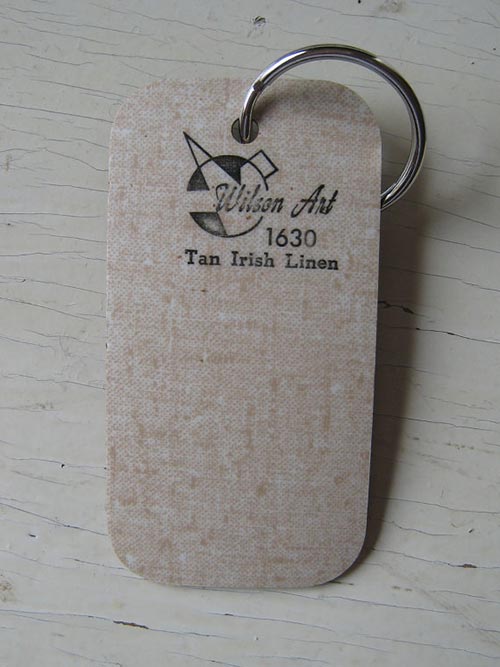
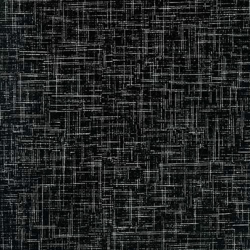
The most popular designs for laminate countertops in mid century America? Boomerang and glitter certainly must be near the top — but we also believe that linen laminate countertops were top sellers, too. It is easy to see why this pleasing texture would be a hit. The tone-on-tone coloration prevents counter tops from looking like a single slab ‘o color, while the “design” is neutral enough to accommodate ‘most any decor. Probably even hides the crumbs pretty well! For this story, we are able to show you seven different colorways of vintage linen laminate counter tops — taken from our recent story about the stash of vintage Wilsonart laminate samples spotted on etsy.

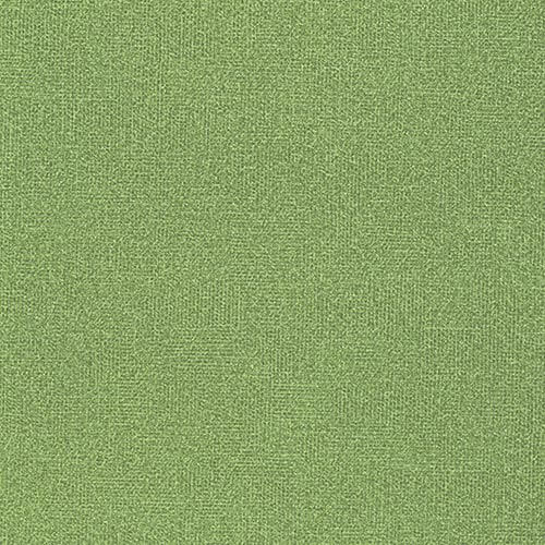
green linen laminate counter tops vintage-wilsonart-grey-fine-linen-laminate-countertops vintage-laminate-countertops

Update: Since it’s coming up in the Comments, here is my famous “Graveyard of the Atlantic” laminate-name story.

tan-linen-laminate-countertopsvintage-wilsonart-tan-irish-linenvintage-wilsonart-red-irish-linnen

vintage-red-linen-laminateThe only photo of vintage linen laminate counter tops on the blog so far is this show (above) from an estate sale time capsule house that Pam visited back in 2009. Could this be Wilsonart red Irish linen laminate?

Pam says that she originally had linen laminate countertops in two of the bathrooms in her house. They were in bad shape, and were replaced with some retro look laminates available at the time.

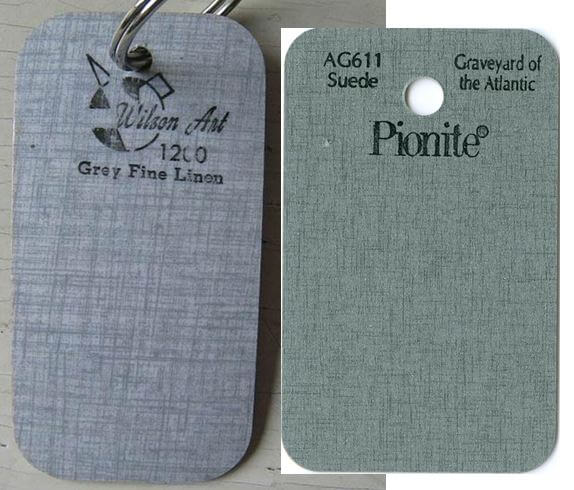
Vintage linen laminate on the left; new Pionite on the right. Not too bad a "design" match, but colorways are very different. The market today is "greige"....

Vintage linen laminate on the left; new Pionite on the right. Not too bad a “design” match, but colorways diverge…

Several companies today make laminates they call “linen”. Check out the Pionite linen — which sort of approximates the vintage “Fine Linen” above…. Wilsonart has a new linen — but hmmm too sharpened…. And of course: See all our stories about laminates that might suit a retro remodel in our Kitchens / Countertops category here.

Readers — do you have vintage linen laminate counter tops in your kitchen or bath?

The post Linen laminate counter tops, another mid century favorite appeared first on Retro Renovation.
Retro counter top laminates from Lab Designs

$
0
0

Lab-LaminatesThanks to reader Ashly for today’s tip:  A new source for kitchen and bathroom counter top laminate,  Lab Designs. We have not seen these designs in person, but viewed online, they seem promising. After Ashly’s comment, Pam called the company for pricing information. According to the representative, most laminates they have deliver for $1.90-$2.10 per square foot — which calculates to about $64 for a 4 x 8 sheet.

laminate-Arctic-Retro

For vertical use only.

laminate-Ebony-Retro

For vertical use only.

When you are looking at Lab Design’s collection online, take note whether it is for “vertical installation only” — we interpret that to mean not rated for the constant abuse that horizontal surfaces take.In her comment, Ashly mentioned the Arctic Retro and Ebony Retro designs – but unfortunately — these are both for vertical use only. Luckily there are still many other exciting choices rated for horizontal installation in the abstract collection.

The retro counter top laminates from Lab Designs

Laminate-Ivory-Organica-1400Above: Ivory Organica — a fun pattern in nice pastel colors — that would look great in a kitchen or bathroom.

Design study: Notice how Ivory Organica’s pattern is “multi-directional”. Pam learned that term recently from Grace Jeffers. That is, the laminate design does not look like it is running in only one direction. This Lab Design pattern runs both north and south (if you will) equally. Most vintage laminate was “multi directional,” Grace seemed to be saying. Isn’t this nuance interesting?!

Laminate-Beige-Organica-1400Above: Beige Organica — same cool pattern with a more neutral color scheme.

Laminate-Tangerine-Fabrique-14Above: Tangerine Fabrique — great for your flower power kitchen.

Laminate-Verde-Fabrique-1400Above: Verde Fabrique — pretty close to our Retro Renovation color of the year — Broyhill Premier Chapter One Lime Green — don’t you think?

Laminate-True-Blue-Fabrique-14Above: True Blue Fabrique — a close relative of Bitossi Rimini Blu.

Laminate-Yellow-Fabrique-1400Above: Yellow Fabrique — another great choice for a sunny flower power kitchen.

Laminate-Red-Fabrique-1400Above: Red Fabrique — a good option for vintage 50s style kitchen.

Laminate-Plum-Fabrique-1400Above: Plum Fabrique.

Laminate-Black-Fabrique-1400Above: Black Fabrique

Laminate-Charcoal-Fabrique-140Above: Charcoal Fabrique

Laminate-Whisper-Batiste-1400Above: Whisper Batiste — a nice option for a neutral linen look.

Laminate-Fog-Batiste-1400Above: Fog Batiste — another neutral linen look option.

Laminate-Chile-Mesh-1400Above: Chili Mesh — not quite linen, but it reads as a fabric-like texture.

Laminate-Apple-Tesseract-1400Above: Apple Tesseract — not quite a linen, but a nice texture and color.

Laminate-Nutmeg-Tesseract-1400Above: Nutmeg Tesseract — this would work well in a 70′s style kitchen.

laminate-Thyme-Tesseract-1400Above: Thyme Tesseract — another good option for a 70s style kitchen remodel.

Though there isn’t a boomerang or sparkle in sight — this collection of abstract laminates would feel at home in many a retro kitchen or bathroom. And hey — they have color — which is a beacon of light in today’s sea of greige granite laminate.

See our extensive research about laminates suitable for a retro or vintage kitchen or bathroom in our Kitchen / Countertops category.  

The post Retro counter top laminates from Lab Designs appeared first on Retro Renovation.
GE Textolite laminate patterns from 1953

$
0
0

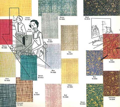
GE TextoliteLet's-decorate-1953This week’s vintage catalog explores one of our favorite subjects here on Retro Renovation — vintage laminate patterns. And what a terrific find this is: A catalog full of GE Textolite laminate patterns, colors, uses and construction tips fresh from 1953. We can add these vintage GE Textolite patterns to the list of laminate we’d love to be able to buy today — right next to the vintage GE Textolite samples Pam scored from the 1960-1965 era. Oh if only there was a fairy retro godmother who could use her magic wand to transform some of today’s laminate options into a few of these retro styles. Pam predicts: It will happen yet!

GE-Textolite-vintage-kitchen-with-laminate-countertopsIt’s interesting to know that General Electric manufactured and marketed laminate back in the day, isn’t it? Pam lives one town over from the home of the former GE Plastics. Located in Pittsfield, Mass., GE Plastics was one of their GE’s most storied divisions (GE sold the division in 2007.) Pittsfield, Mass. and nearby Lee, Mass., also have lots of connections — even today — to the laminate industry. Note in the photo above: Cabinet pulls that are also kitchen towel rods.

Retro-GE-Textolite-patternsMy absolute favorite among these 1953 designs is “Medley” — especially in Cherry or Spruce. So bright and happy — perfect for a sunny vintage kitchen. I’ve never seen any Cross Current or Ming in the wild — but I love their random patterns, too.

Vintage-GE-Textolite-colors-and-patterns

Here we have the classics — regent, linen and pearl textured laminates in all the typical 1950s colors.

GE-textolite-colors-and-patterns-retro

There is even a selection of wood tone laminates and a “Hyaline” apparently designed to look like slate. And look at the text in the bottom right hand corner: Knotty Pine laminate! We sure would give an eye tooth to see that in its natural habitat.

edges-for-vintage-laminate-counters

This catalog details the available edging methods, too. We have sources for many, maybe even most, of these style — in aluminum and in stainless steel — if you’re looking, please see this story. 

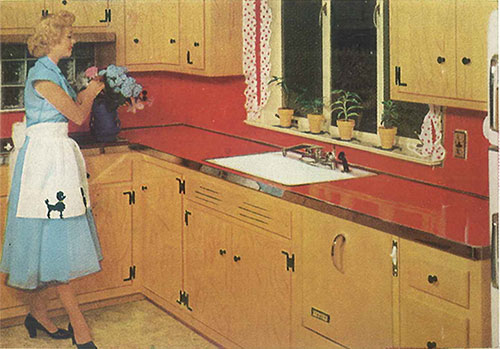
Vintage-kitchen-with-red-laminate-counters-and-metal-edgingThis kitchen is classic 1950s — the red laminate counter tops, the laminate backsplash, steel edging, sink with hudee ring. The laminate is so easy to keep clean that she has ample time for flower arranging — sigh.

vintage-green-and-yellow-kitchen-with-laminate-counter-topsAnother happy customer — enjoying her Monotop laminate counter as she reads by the kitchen window. Notice that with this Monotop design, the laminate is “postformed” — meaning the counter top is all one piece — the laminate is molded… bent … to create in integral backsplash and edge — no piecing on a backsplash , no separate counter top edge. This was a major advancement in counter top design… once into the 1960s, use of metal edging was on the decline in favor of the post-formed edge. We do not know if GE was first with this innovation. But at least now, we have the date of 1952 to work with.

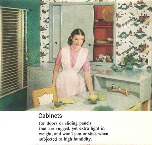
vintage-kitchen-green-and-yellow-retroGE Textolite also campaigned for cabinetry and table tops made of laminate. The laminate door cabinets look clean and fresh, and the built-in dining area with shelf is a great idea. The red interiors of her upper cabinets have me thinking about painting the insides of my kitchen cabinets a similar shade.

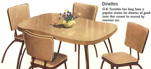
vintage-GE-Textolite-dinetteAmong the practical uses for GE Textolite laminate — attractive and durable dinettes.

Laminate-laundry-cover-panel-retroAnother great idea — make a fold down panel to cover the laundry and add extra work space — especially if the washer and dryer are located in the kitchen.

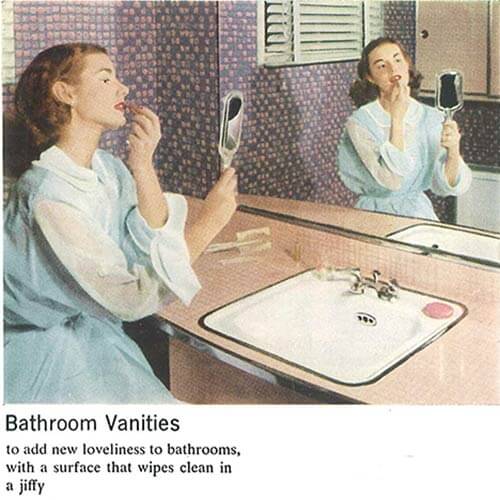
vintage-pink-laminate-vanity-in-bathroomLook — steel counter top edging in the bathroom too. It works nicely with the hudee ring on the sink.

vintage-laminate-furniture-retroLaminate is a great choice for coffee tables — no coasters needed.

Thanks to the Building Technology Heritage Library and archive.org for making this catalog available via creative commons license.

SeeAllOurVintageCatalogsSMALL

Tips to view slide show: Click on first image… it will enlarge and you can also read my captions… move forward or back via arrows below the photo… you can start or stop at any image:?

The post GE Textolite laminate patterns from 1953 appeared first on Retro Renovation.

10 ways to do counter top edges — from 1953

$
0
0

counter top edges

In this morning’s story showing a complete 1953 catalog of GE Textolite laminate, we noted this graphic showing the variety of ways that a homemaker could edge her kitchen counter tops in 1953. It’s nice to have this “authentic” historical record. I count 10 ways to edge a laminate counter top — and point you to stories we have done about where you can find the materials today to recreate these looks:

edges-countertops

Edges for round or square edges:

  1. Round corner — edged with the same laminate you use for the counter top. 
  2. Tee nosing of flat extruded aluminum — To edge a rounded corner with metal trim, you must use a tee-molding.  RetroTrims.com is my favorite go-to place for aluminum tee-moldings, because they are an advertiser here and because they specialize in metal trims. Other sources could include Heffrons.com (also an advertiser), New York Metals, Outwater Plastics, Bars & Booths.
  3. Tee nosing fluted and colored aluminum – RetroTrims has some fluted designs, as do the other suppliers noted above. Note: I know of NO vendors of kitchen counter top-sized edging into which you can slide colored strips of vinyl, or what have you. Bars & Booths has one, but it’s quite wide/high — 3″ high. That’s okay for a diner style table, but way too tall for a kitchen counter top.
  4. Postforming outside bend — Postforming simply means “curved with heat” — the counter top maker needs to do this for you.

Edges for square corners only:

  1. Square corner — I think that all they are referring to here is using the laminate itself as an edge.
  2. Textolite edge — I don’t understand the difference here vs. above. But from the illustration, it appear Textolite must have had a special crisp edge as part of the laminate manufacture, which itself could be considered a design option. This is kind of ironic — because today, laminate manufacturers are going all out to try and minimize any seams at all and to replicate the look of marble and granite and the like with their postformed edges.
  3. Wood edge flush — I don’t have a specific source. I *think* this type of wood edging is pretty common.
  4. Stainless steel edge — New York Metals is the only place I know of with stainless steel edging. I used this in my kitchen, and continue to adore it. Here’s my story on the pieces I used.
  5. Aluminum edge — RetroTrims.com is my go-to place, because they are an advertiser here and because they specialize in metal trims. Other sources could include Heffrons.com (also an advertiser), New York Metals, Outwater Plastics, Bars & Booths.
  6. Aluminum plain or decorated — I do not know of any suppliers with an aluminum edge with a profile this pronounced.

Thanks to the Building Technology Heritage Library and archive.org for making this catalog available via creative commons license.

More tips on counter tops and edging:

The post 10 ways to do counter top edges — from 1953 appeared first on Retro Renovation.
Brady Bunch “bittersweet” orange kitchen counter tops — from Pionite

$
0
0

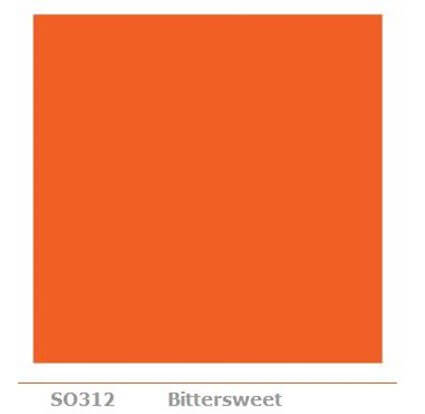
bittersweet colorWhen reader Ann told me she had used Pionite laminate in Primary Yellow for her 1965 kitchen Retro Renovation, I jumped on over to Pionite to look at the chip. And golly, Ms. Molly, wouldn’t you know it, but sitting right there in the same row of color chips was: Bittersweet. I didn’t know that any laminate maker still produced Bittersweet.


stangl bittersweet

photo courtesy dixie-too on ebay

I think that Bittersweet is a super classic 1960s and 1970s color. I first learned about it, because we collect Stangl pottery, and one of their patterns is “Bittersweet”. It’s a color that endured many years — more than I guess I knew, as here it is again (or still?) today.

I tend to believe that the kitchen counter tops in the Brady Bunch kitchen were exactly this shade of orange. Here’s short clip from CBS that shows Mike Brady struggling to do women’s work, ugh, in the Brady kitchen:

bittersweet colorReaders, what do you think? Are Bittersweet and Brady Bunch orange one in the same?

Anyway, this Pionite palette of solid colors is pretty darn nice. There are two pages of color options — with lots of off-whites, which are always classic, and with many true retro colors — French blue, Boxwood, Surfin’ USA, Burgundy, Royal Burgundy — and a nice Primary Red.

Orange is my favorite color. It was the first Retro Renovation Color of the Year, in 2011.

I also loved the Brady Bunch, of course. Looks like you can see lots of, or maybe all of, the episodes here.

Oh. Yes. This blog is about decorating. Want your own Brady Bunch orange countertops? Get them, along with other retro solid colors, here: Pionite solid laminate colors — 2 pages

The post Brady Bunch “bittersweet” orange kitchen counter tops — from Pionite appeared first on Retro Renovation.
Interior brick veneer made from real bricks — from BrickWeb and Old Mill Brick

$
0
0

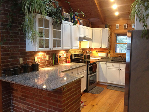
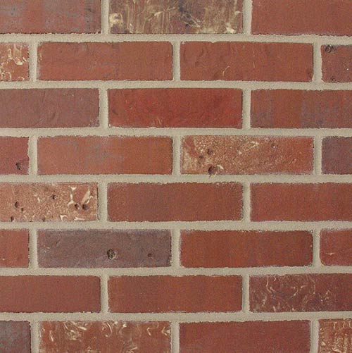
interior brick veneer from brickwebBrick veneer walls and back splashes seem to have been a popular feature in 1960 and 1970s kitchens — when the movement to earthy decor took hold. Today, we take a look at a company that sells thin versions of real interior brick veneer, which sounds relatively easy to DIY install — and certainly looks great.

thin-brick-in-kitchen

There are many places in a mid century home where interior brick veneer can typically be found in vintage houses — in built-in planters, on fireplaces, flooring, in kitchens, and on entire walls maybe especially in basement rec rooms. Brick can add incredible character, dimension and warmth to a home.

If you love the look of brick but don’t want to have to hire a mason to get the job done — Brickweb Thin Brick (also sold under the name Old Mill Brick) might be just what you’ve been searching for. Thin Brick is actual brick — cut into thin pieces — that can be applied indoors or out on nearly any surface. Because it is installed in a manner similar to tile — it is easy for the homeowner to install. Available in 12 colorways, the possibilities for use in mid century home decor seems to be limited only by your imagination.

Linda, my contact at Old Mill Brick — sent a little more information about the company’s history:

The Old Mill Brick Company was established in 2008 by Garrick Hunsaker. Mr. Hunsaker has over 30 years of experience in the construction industry. He is the creator of Old Mill Brick’s patented thin brick installation systems. He is a licensed general contractor and has owned and operated several building contractor and sub-contractor companies specializing in sales and installation of interior and exterior masonry in the commercial and residential markets. Mr. Hunsaker serves as Old Mill Brick’s President and CEO overseeing all company operations with the emphasis on strategic planning, manufacturing, and sales.

Old Mill has developed several patented, easy to install panel systems so that they can be used with any thin brick, including tumbled and cast. The Old Mill Brick system allows customers to explore and design many installation options. In 2009 our line of patented Do-It-Your Self thin brick systems were finalized and have proven to be the most effective way to install thin brick on the market today. We have the ability to customize our panel to meet any brick size. The end product is maintenance free for both exterior and interior design.

From the website:

What is Brickweb® Thin Brick?
Brickweb is an award winning – patented thin brick product made from the highest quality real, cut, kiln-fired clay brick. A full piece of brick is cut to approximately ½ inch thick. Several thin bricks are pre-mounted on a durable, fire resistant, fiberglass mesh with the brick already laid out and aligned for quick and easy installation. Brickweb is the easiest and fastest method available to install thin brick for interiors or exteriors.

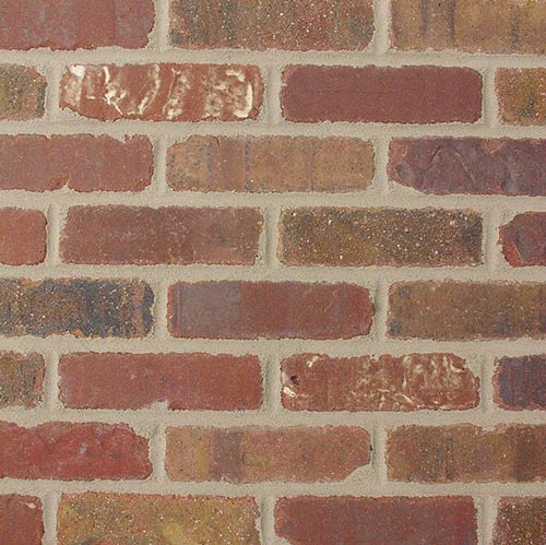
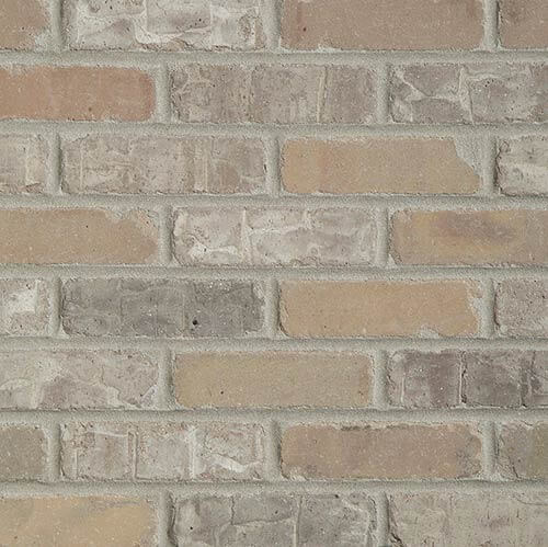
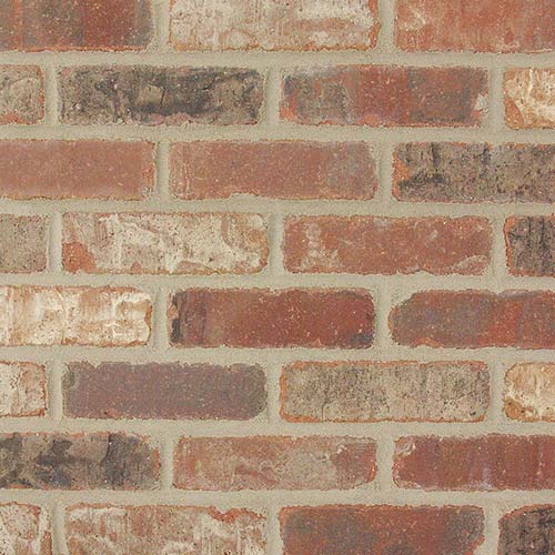
Brickweb is available in pre-assembled flat sheets and corner sheets, with 12 color blends to choose from. The primary 8 color blends are made from “tumbled brick”, having a classic old world, aged, or weathered look and feel. The 4 other color blends are commonly known as “straight brick”, and are made from the same brick but are not tumbled and provide a more uniform (flat and straight) appearance with less color and texture variation.

Where Can I Install Brickweb Thin Brick??
Places to use thin brick are virtually endless both interior and exterior. Some ideas where to use Brickweb include: fireplace or stove surrounds, accent walls, columns, kitchen or bath back-splash, flooring (on a solid surface such as concrete, backer board, etc.), chimney, exterior siding, kitchen islands, bed headboards, wine cellars, man caves, porch or stairs, table tops, outdoor BBQ or kitchen, home exteriors, accent walls, and more.

According to the website — Thin Brick can be applied around fireplaces or stoves, can be used inside and out, and can be painted, stained or sealed to achieve your desired look. It is available for purchase through the BrickWeb website or through Home Depot or Lowes — and costs about $7 per square foot.

michelle williams in the movie dickPam says: Using brick in kitchens seems to have been particularly popular in the 1970s. Above: Pam’s photo of her television, showing the movie “Dick” starring Michelle Williams (shown) and Kirsten Dunst. Best. 1970s. Kitchen. Ever. House. Too.

Interior brick veneer colors from Brick Web:

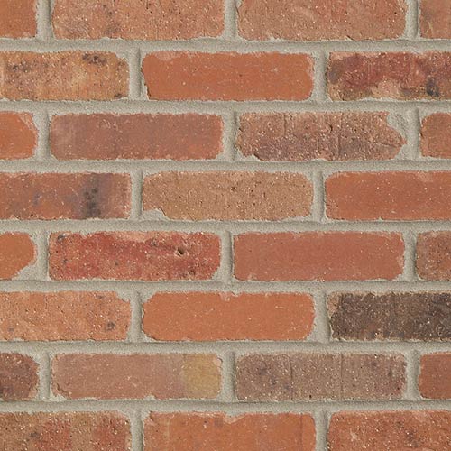
Boston-Mill-thin-brick-veneerAbove: Boston Mill Thin Brick

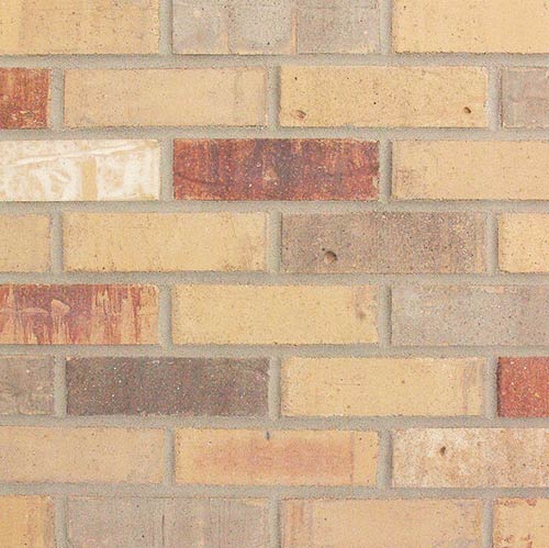
Colombia-Street-think-brick-veneerAbove: Columbia Street Thin Brick

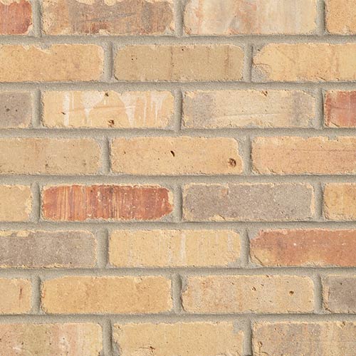
little-cottonwood-thin-brick2Above: Little Cottonwood Thin Brick

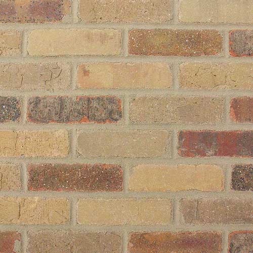
Little-Cottonwood-thin-brick-veneerAbove: Rushmore Thin Brick

Cordova-thin-brick-veneerAbove: Cordova Thin Brick

castle-gate-thin-brick-veneerAbove: Castle Gate Thin Brick

Dixie-CLay-thin-brick-veneerAbove: Dixie Clay Thin Brick

Chattanooga-thin-brick-veneerAbove: Chattanooga Thin Brick

Pony-Express-thin-brick-veneerAbove: Pony Express Thin Brick

Alamo-sunrise-thin-brick-veneerAbove: Alamo Sunrise Thin Brick

Promontory-thin-brick-veneerAbove: Promontory Thin Brick

independence-thin-brick-veneerAbove: Independence Thin Brick

The variety of available colors plus the possible ways to further treat the bricks with stains, sealers or paints assures that most everyone could find the right brick for their home improvement project. We sure like the look of Brick Web’s thin brick!

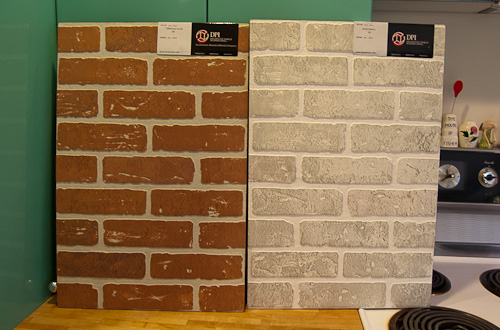
Cheap and cheerful brick veneer alternative: Paneling

brick veneer wall panelingYes, if you just wanna go cheap and cheerful, Pam has featured paneling that looks like brick.

Readers, do you have noteworthy uses of brick inside your home that you really like — and which could be replicated with a product like this thin brick veneer?

The post Interior brick veneer made from real bricks — from BrickWeb and Old Mill Brick appeared first on Retro Renovation.
Curved postformed laminate counter top edges — as early as 1952

$
0
0
postform counter top

Anatomy of GE’s Monotop laminate counter top with postformed edges and backsplash: Profile view of framing, circa 1953.

In the early days of the blog, I recall, there was a bit of a commenting cat fight. I showed a plaid laminate counter top with curved front edges and an integral back splash — it was all curvy, too. You know what I’m talking about — the counter has no edging on the front edge and the whole thing continues in one piece even up to and including a (typically) 4-inch backsplash. This is called “postforming” — or a “postformed counter top” — that is, when you bend the laminate to curve around edges, rather than cut it and square off everything. It’s an innovation that does not seem to have been immediately available with laminate counter tops. Not available, we presume, because it was tricky to get the laminate to curve without breaking.

GE MonotopBack to the cat fight — which was actually between my mother (or maybe it was me, arguing on her behalf) and a reader. They disagreed on whether the curvy postformed counter top I was showing could have been from the year I said it was — like, circa early 1960s. The reader said no. My mom said yes. My mom said she HAD the counter top, in our adorable little bungalow in Carlsbad, California (the first house I ever lived in that I still remember… sweet memories.) I believed my mom — because we homeowners remember these things!  Although, it is highly possible I am remembering this blog story incorrectly. Because I cannot find it on the blog. A prize to anyone who can.

GE Monotop

Verified: Postformed laminate counter tops as early as 1952

Are you still with me? Anyway, when we recently featured a complete catalog of 1953 Textolite – I finally saw some proof of just when postformed counter tops may have begun appearing in the U.S. marketplace. According to the catalog, GE offered its first postformed design — the GE Monotop — in 1952.

GE Monotop surface properties

Above: More info about the GE Monotop. The laminate for the Monotop was three times thicker than “Standard” laminate — Monotop laminate was 3/16″ thick vs. 1/16″ thick for Standard. I hypothesize: This is why the stainless steel “connectors” were required where the laminate pieces met. According to the Surface Properties list, Monotop could withstand much more abuse from certain everyday substances. And if you go back to the very first photo shown in this story, it appears to have been so strong it did not need to be adhered to a full substrate. Wow. It was available in only five Cross Current colors. Here’s the Cross Current palette from the catalog:

cross current laminate

In a nut: The postformed GE Monotop counter top must have been pretty darn high-end.

So who was the very first to manufacture and sell postformed counter tops?

That is, which laminate maker was the very first to market with postformed counter tops?  I will keep my eyes open and hope to wrestle this question to the ground one day. For now, the stake goes to GE, 1952, because of the confirmation in this catalog.

For this story, I reached out to Formica with this question, and their initial response was “late 1960s” for their company. I am skeptical of this answer, though, because once I started looking more closely through my photos of kitchens featured previously on the blog, I quickly found photos of postformed counter tops from 1954 and on.

1954 micarta counter top

Here’s a great view of a postformed counter top that does NOT have the stainless steel divider strips. I am not sure if this was an “advancement” or whether this laminate is just thinner and therefore, more easily joined at the seams. This image is from Micarta (one of the earliest laminate makers) — 1954.

1954-american-standard-pink-countertop-cropped_0

American Standard kitchen —  yup, postformed laminate counter tops in this ad from 1954.

Are postformed counter tops “authentic” for 1950s houses?

Suffice to say: If you are wondering, “Is it authentic for me to have a postformed counter top and back splash in my mid century kitchen?”, the answer looks to be: Starting in at least 1952, yes, postforming was available. However, I will make an educated guess — these were upscale — maybe even “the granite counter tops of their day”! Looking at the GE diagram, it appears that creating a postformed counter top took real finesse — this was a special factory order, you could not post-form this counter on-site. Note, I am talking “early days” of postforming here.

Laminate with edging: Much more common for many years to come

On the other hand, it was relatively easy for any contractor or even an intermediately competent DIY homeowner to adhere laminate on to a flat surface and then edging the flat edges with with aluminum, stainless steel, laminate or wood. So I bet, that squared-off counter tops with edging were even more common, because of all the subdivision and tract housing that was going up across the nation. In these developments, the so-called merchant builders would have been looking to shave off pennies and dollars wherever they could. I’m betting they installed their own substrates and rolled on the the laminate themselves — finishing the whole design with squared-off edges and back splashes.

All this said, by the early 1960s (again, I hypothesize), postforming became the norm. No more edging. I am guessing the technology was (1) either improved to make it cheaper or (2) the look became preferred, and as Americans became increasingly more affluent, they were willing to pay for the upcharge, no problem.

Images of GE Monotop courtesy the Building Technology Heritage Library and archive.org via creative commons license.

The post Curved postformed laminate counter top edges — as early as 1952 appeared first on Retro Renovation.

Learn about Laminate: How laminate was invented and how it is made

$
0
0

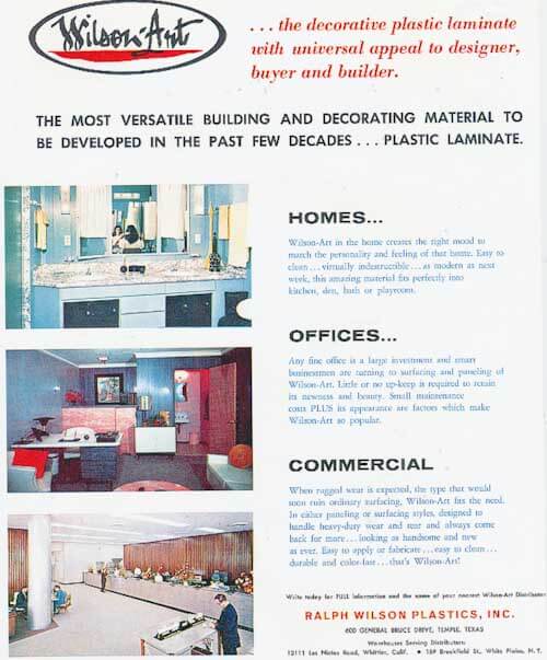
vintage wilsonart ad

grace jeffersLaminate basics: The invention of laminate. How is laminate made? What is laminate made of?

In essence, laminate is a skin, supplying a supplemental finish that is both ornamental and lasting.  In this way, it is a veneer: a thin surface that cannot be used without a substrate. Laminates are usually applied to a substrate of inferior aesthetic and economic value. In the architectural and interior design trades, laminates are categorized as a “surfacing material” or a non-essential overlay, a material applied to achieve an aesthetic effect or to serve a durable function.

EDITOR’s NOTE: This story is first
in 
a series on laminate history and
design, written
by Grace Jeffers
on behalf of Wilsonart. I’m really
thrilled about it – because I consider
Grace Jeffers to be America’s foremost
expert on laminate history. But I also
want to make it very clear: This is not
a typical”product placement” or
“sponsored post” – Wilsonart is not
paying
 me anything to run these
stories. I accepted the series
proposal because I thought the
content would be great for Retro
Renovation – and because I’m
thrilled to be working
closely on this project with Grace.
Read more about this
collaboration — read Grace’s
complete bio — and read
the complete series – here.

It surprises many people to learn that laminate, the material commonly found on kitchen counter tops, has been around for more than 100 years. The first laminates were what we call industrial laminates. They were not decorative — instead of being patterned or brightly colored they came only in a caramel brown color, a result of the polymer resin that was used to make them. These first laminates were made using only phenolic resin, the same polymer used in Bakelite jewelry. Not surprising, as the man who developed phenolic resin in 1906, Dr. Leo Baeckelund also invented Bakelite. By 1907, laminates were being made at Westinghouse in Pittsburgh, Pennsylvania. The first laminates were made as casing for electrical parts, mostly in the form of gears and tubes. Two employees at Westinghouse championed sheet laminates, but the company did not see any benefit to producing them. In 1913 those two employees left to form the company we know today as Formica. 

Wilsonart House featured in Bakelike Review magazineThe invention of melamine makes bright colors possible

Why, when we think of laminate, do we think of America in the mid-20th century? Initially, laminate was made purely with phenolic, which could only be used to produce a caramel brown colored finish. It wasn’t until 1938 — following the invention of a new kind of resin, melamine — that laminate could be engineered with a top layer of colored paper. Melamine bakes, or “flows”, to create a hard, clear, topcoat finish, which bonds and protects the “decorative” paper layer beneath. This important invention made the brightly colored laminates we associate with kitchen counter tops of the 1950s possible — and opened up a brand new world of design possibilities for American kitchens and bathrooms. Given the state of the American economy in the late 30s, laminates were not marketed to the consumer until the very end of the 1940s, after the Second World War. Consumers ate this new “modern” material up — laminate became simultaneously popular in commercial settings, such as diners and bars, and in the home as dinette tables, cabinetry and counter tops.

laminate historyLaminate was seen as a modern marvel. It was bright and cheerful, impervious to stains, easy to clean and never required polishing. Think about the other materials that were used for the same purposes: Marble was porous, stained and was cold to the touch. Wood stained, scratched and required polishing. Linoleum could be scored, it stained, and it yellowed with time and sunlight.

laminate countertops wilsonartLots of names for laminate

Today, laminate is called by many names: laminate, plastic laminate, p-lam, and yes, sometimes it is called generically by the brand name Formica®. In Canada, it is often generically called Arborite® because in the post-World War II era that was the name of the company that made and popularized it there. There are currently five main brands of laminate manufactured in the United States: Wilsonart®, Formica, Pionite®, Nevamar® and Lamin-Art®.  Of these five companies, only Wilsonart and Formica are available to consumers through home centers. Some additional laminate brands are imported for sale in the U.S., including the Italian manufacturer Abet Laminati, the company that supplied the colorful laminate to the Memphis Group and Studio Alchimaya. Laminate is a misleading word because it literally means made of layers, layers that are also called laminae (plural) or lamina (singular). By this definition, plywood is a laminate and so is chocolate-layered cake. The laminate we know and love as a surfacing material – used most often for kitchen and bathroom counter tops — is more accurately called High Pressure Laminate (HPL) or specifically decorative high pressure laminate since there are also industrial high pressure laminates which are not decorative.

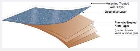
laminate layersHow laminate is made

The decorative high pressure laminates in our homes consist of sheets of paper that have been coated or impregnated with two types of resin, stacked on top of each other and placed into a press where they are cooked at a minimum of 265 degrees F. at a pressure of approximately 1,200 pound per square inch (psi) for about an hour. Under this pressure and heat, the resins flow and the stack and the resins transform into a single sheet of homogenous composite material. It surprises most people to learn that plastic laminate is approximately 70% paper and 30% polymer (phenolic and melamine) resin.

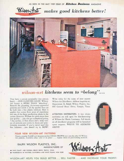
wilsonart ad 1959

Plastics. Polymers. Resins.
Phenolic. Melamine. Chem
101
time: Let’s get to know
how to use our terms correctly.Plastic is a word that means
“capable of shaping or molding,”
from the Greek plastikos
meaning “able to be molded”.
Horn is a natural plastic, it can
be heated and bent into a shape.
Tortoise shell is as well. Phenolic
and melamine are synthetic
plastics. All plastics are polymers.
The word polymer comes from
the Greek polymeres meaning
“having many parts”. Polymers
are categorized by how they
are constructed on the molecular
level; they are made up of
strands of connected units of the
same size, like a beaded necklace,
or many, many beaded necklaces
all mixed together. It is the
organization of the molecules that
ultimately determines what
material is, and polymers are the
only material that demonstrates
this “beaded necklace” order.Plastic or Polymer? The general
public uses the words
interchangeably but an engineer
or a material scientist would
only refer to polymers.

Resin is another word that we
commonly confuse. Merriam
Webster Dictionary defines resin
as a group of  natural, flammable,
fusible organic substances that
are formed as secretions in plants.
They are soluble in organic solvents,
but are not water-soluble. Resins
can be solid or semi- solid, and
are usually transparent or
translucent and yellowish-brown
in color.

As you can see, following the
strict definition, resins are natural.
Pine resin is the original “resin”;
the Greeks called it rhetine, which
is the root of our English word.
Amber is pine resin hardened
into a semi- precious stone-like
nugget.  Any plant that produces
sap is producing resin. Resins
are also polymers, polymeric
in their structure.  They are
used in varnishes, printing inks,
in medicine, and in plastics.

But our modern definition of
laminate
is broader and more
confusing, because we have
added the concept of synthetic
resins into the mix. Natural
resins are natural plastics—
they are moldable polymers
found in nature. Rubber is a
natural resin, the sap of the
rubber tree—it is also a natural
plastic. We call the liquid state
of polymers before they cure
“resin”; when cured, they form
plastics.

Now — don’t you feel much
smarter already today!

The top layer: A special clear, tough combination

The top layer of this laminated stack of paper is a sheet of melamine-impregnated alpha cellulose overlay paper. This special type of paper is made with very high-grade wood fibers (‘alpha’ meaning ‘first’, and ‘cellulose’ meaning ‘insoluble substance that is the main constituent of plant cell walls’; both cotton and wood produce cellulose). The paper is white in color when dry but very porous, not unlike very thin toilet paper. Between the paper and the melamine, this layer becomes completely clear in the pressing.

The second layer: The decorative design or color

The clear, tough melamine/alpha cellulose top overlay lies on top of the second layer of the laminate — the decorative layer. The decorative layer of laminate gives the counter top (for example) its design or color — its aesthetic appeal. The decorative layer also is permeated with melamine, which is pushed through the overlay sheet and penetrates into the decorative layer. The decorative layer can be created in three different ways: It can be a digital print (white paper which is printed with a wood grain, stone or abstract pattern); it can be a solid sheet of color; or it can be a solid sheet with “inclusions” (such as gold glitter, a Retro Renovation favorite not currently available in North America).

The core underneath: Kraft paper

The core consists of layers of kraft paper treated with phenolic resin. There are three basic grades of laminate: vertical, horizontal and post-forming. The main difference between the three is the number of layers of kraft paper. Kraft paper is the same kind of brown paper used for grocery bags. The word kraft comes from German and means strength. The kraft paper used in laminate is often made of recycled material.  Since it is only the backing material and will not be seen once the laminate is installed, it is possible to use a thicker, less aesthetically pleasing paper, as opposed to the thin alpha cellulose paper used in the top layer, which is milled thin enough to “disappear” when imbued with resin. All three layers together equal one of the most popular counter top innovations ever. The melamine overlay of the top sheet and the kraft paper layers underneath work in tandem to create a laminated material that is stronger than each material on its own. Scientists and engineers sometimes refer to laminate as a composite material because composites work the same way: Two materials combine to make a third, even stronger, material. High Pressure Decorative Laminate (HPDL) meets an industry standard for wearability, scuff resistance, stain resistance to 29 different agents, radiant heat resistance, conductive heat resistance, UV light resistance, blister resistance, cleanability, appearance and post-forming capabilities (its ability to wrap around a radius). Because of its early use as an electrical insulator, laminate was associated with standards set by the National Electrical Manufacturers Association (NEMA). ASTM International, formerly known as the American Society for Testing and Materials (ASTM), is now associated with test methods for laminate and most other materials in our homes, such as textiles and vinyl flooring.

Laminate today — compared to laminate in the 1950s

Laminate today is produced in the same was as it was in the 1950s, with some differences.  In that period, laminate had a higher percentage of polymer (phenolic and melamine) resin. The exact percentage is unknown but it is estimated that mid century laminate was 40% polymer and perhaps as high as 50% depending on the grade. Interestingly in today’s laminate, the paper-to-polymer ratio makes for a stronger material. It has been said that gram per gram, laminate is actually as strong as steel. Mid century laminate also has a different hand-feel than today’s laminate. It feels almost oilier, slippery in a different way. Part of this texture is due to the finishing technique, which will be described in a later story.


To take a virtual tour of Wilsonart’s manufacturing facility:

Next in our series:

  • More on grades of laminate and finishes historically and today.
  • Also coming up: Understanding inlay laminate and rotogravure and digital printing of laminate.

Readers — what questions do you have about laminate history that Grace can help answer?

The post Learn about Laminate: How laminate was invented and how it is made appeared first on Retro Renovation.
New Formica 100th Anniversary book —“Formica Forever”— is out

$
0
0

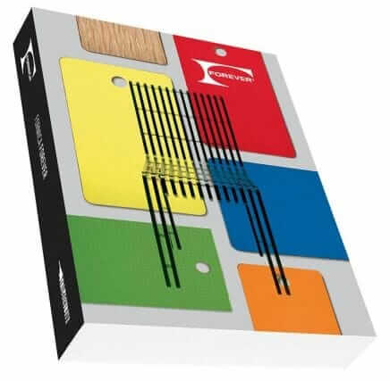
formica bookIt’s Formica’s 100th anniversary this year. In January, we saw the anniversary design collection. Now, the purty looking book is out. It promises “more than 400 images — including advertisements, logos and product swatches organized by color. It’s modeled after a Formica® laminate swatch book from the 1960s, features three historical essays, and comes in an easy-to-read size. It looks like the book can be pre-ordered on Amazon for delivery Sept. 30:

Following is Formica’s news release about the book:

Formica Group, the inventor of laminate, celebrates 100 years of global design with Formica Forever, a commemorative book that captures the company’s 100-year evolution through cultural shifts, economic uncertainties, trend exploration and global growth.

“The Formica® brand has touched every aspect of our lives each and every day, surfacing millions of spaces in which we gather, work, learn, heal, shop, eat and play,” noted Mark Adamson, former CEO of Formica Group and current CEO of Fletcher Building, parent company to Formica Group. “Many people have grown up with the Formica® brand, and this book encapsulates the company’s influence in interior design as well as its struggles and perseverance to remain a viable business through changing ownership, global expansion and the changing landscape of the surfacing market.”

Designed by Abbott Miller, a partner in the renowned international design consultancy Pentagram, the 408-page, 6.5″ x 9.5″ book contains more than 400 images and is modeled after a Formica® brand laminate swatch book from the 1960s. ”We didn’t want a cumbersome coffee-table book; we wanted to create something celebratory rather than grandiose, authoritative but also lively,” Miller said. The book is published in collaboration with Metropolis Books and will be available in early August at bookstores worldwide as well as online.

Formica Forever features:

  • 100 years of worldwide visual assets, including advertisements, logos and product swatches organized by color
  • Three essays in which notable authors lend perspective to the various Formica Group storylines that have unfolded over the course of the last century, including:
    • Global Business Expansion (authored by Phil Patton)
    • Modernist Design Legacy (authored by Alexandra Lange)
    • Cultural Impact (authored by Peter York)
  • Literary excerpts referencing the Formica® brand, which demonstrate both its importance in pop culture as well as the challenges faced by Formica Group to diligently protect the brand
  • An appendix featuring six color-coded translations:  French, Spanish, Finnish, Thai and Simplified and Traditional Mandarin

Formica Forever authors:

  • Phil Patton (Growing Global: A Century of the Formica® Brand and Business) is a design journalist, curator and author. His books include Open Road:  A Celebration of The American Highway; Made in USA: The Secret Histories of the Things that Made America; Bug, a cultural history of the Volkswagen Beetle; and Dreamland, the culture of experimental aircraft. Patton writes regularly about automobile design for The New York Times and has served as a curator for museum exhibitions focusing on automobiles.
  • Alexandra Lange (The Glamour of Utility: Formica® Laminate, Design and Luxury) is an architecture and design critic and author of Writing about Architecture: Mastering the Language of Buildings and Cities. Her work has appeared in The Architect’s Newspaper, Architectural Record, Dwell, Metropolis, Print, New York Magazine and The New York Times. She teaches architecture criticism at New York University and the School of Visual Arts.
  • Peter York (Toward a Wipe-Clean World: Formica® Brand in Context) is a British management consultant, author and broadcaster most famous for co-authoring Harpers & Queen’s The Official Sloane Ranger Handbook with Ann Barr. He also is a columnist for The Independent on SundayGQ and Management Today, and associate of Editorial Intelligence.

In addition to creating the book, Pentagram’s Miller and partners Michael Bierut and Daniel Weil collaborated on the anniversary brand elements, the Formica® Laminate Anniversary Collection and the anniversary display concept.

Note: All the links to Amazon are affiliate links. Hey, a girl’s gotta make a living. However, if there were no such thing as the Amazon affiliate program, we’d still feature this book, cuz mid century kitchen counter tops are all about the laminate, baby.

The post New Formica 100th Anniversary book — “Formica Forever” — is out appeared first on Retro Renovation.

Monel — rare and wonderful vintage kitchen sink and counter top material

$
0
0

Monel-sink

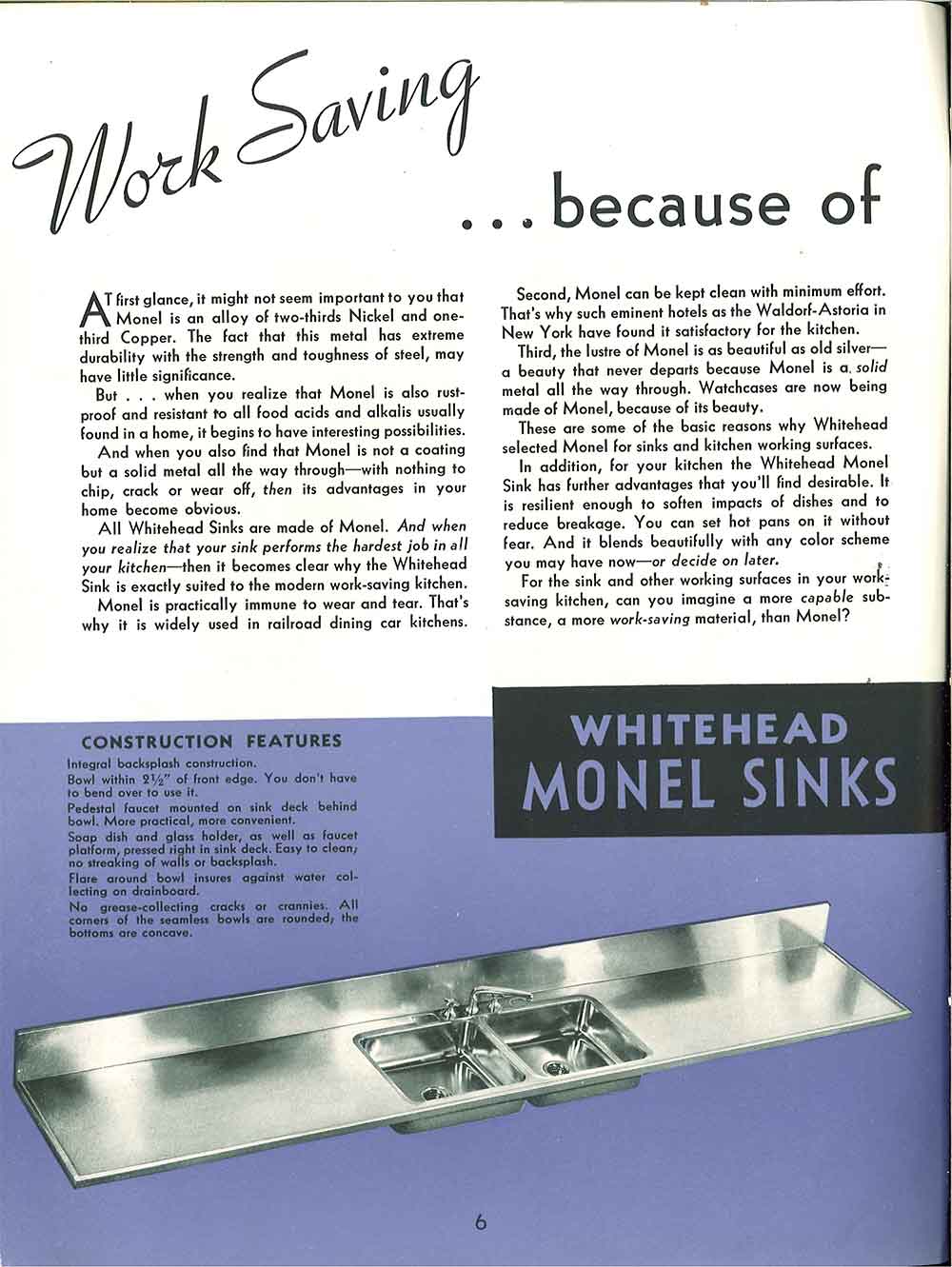
When we looked recently at a 1940 catalog of Whitehead steel kitchen cabinets, we also got a look at Whitehead Monel counter tops and sinks. Whitehead: A very upscale, early steel kitchen — and Monel: A very upscale, metal counter top. And what is this Monel that they speak of? According to the catalog:

  • Monel is an alloy of two-thirds nickel and one third copper with the durability and strength of steel
  • Is rust proof and resistant to all food acids and alkalis using found in a home
  • Is not a coating but a solid metal with nothing to chip, crack or wear off (like the cast iron, porcelain coated sinks that were usually found in kitchens during this era)
  • Can be kept clean with minimal effort
  • Is resilient enough to soften impacts of dishes and reduce breakage
  • Hot pans can be placed on the surface without fear of ruining the counter top

whitehead kitchen

Here is what the text says about Whitehead Monel:

At first glance, it might not seem important to you that Monel is an alloy of two-thirds Nickel and one-third Copper. The fact that this metal has extreme durability with the strength and toughness of steel, may have little significance.

But . . . when you realize that Monel is also rust-proof and resistant to all food acids and alkalis usually found in a home, it begins to have interesting possibilities.

And when you also find that Monel is not a coating but a solid metal all the way through — with nothing to chip, crack or wear off, then its advantages in your home become obvious.

All Whitehead Sinks are made of Monel. And when you realize that your sink performs the hardest job in all your kitchen — then it becomes clear why the Whitehead Sink is exactly suited to the modern work-saving kitchen.

Monel is practically immune to wear and tear. That’s why it is widely used in railroad dining car kitchens.

Second, Monel can be kept clean with minimum effort. That’s why such eminent hotels as the Waldorf-Astoria in New York have found it satisfactory for the kitchen.

Third, the lustre of Monel is as beautiful as old silver — a beauty that never departs because Monel is a solid metal all the way through. Watchcases are now being made of Monel, because of its beauty.

These are some of the basic reasons why Whitehead selected Monel for sinks and kitchen working surfaces.

In addition, for your kitchen the Whitehead Monel Sink has further advantages that you’ll find desirable. It is resilient enough to soften the impacts of dishes and to reduce breakage. You can set hot pans on it without fear. And it blend beautifully with any color scheme you may have now — or decide on later.

For the sink and other working surfaces in your work-saving kitchen, can you imagine a more capable substance, a more work-saving material, than Monel?

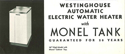
monel

As a tank liner, too.

I found this Wikipedia entry. It says that Monel was trademarked in 1906, and it sounds like the company with the trademark is still in business today. The wiki says that Monel is more difficult to machine than steel… and it much more expensive.

We must keep our eyes peeled to find — and archive photos of — vintage Monel sinks and counter tops in the wild!  I think: Craigslist around New York City might turn some up, if we are eagle-eyed.

Thanks to archive.org and the MBJ Collection for making this vintage catalog available.

SeeAllOurVintageCatalogsSMALL

Tips to view slide show: Click on first image… it will enlarge and you can also read my captions… move forward or back via arrows below the photo… you can start or stop at any image:?

The post Monel — rare and wonderful vintage kitchen sink and counter top material appeared first on Retro Renovation.

“Cusheen” vinyl counter tops — a 1950s option for Youngstown Kitchens

$
0
0

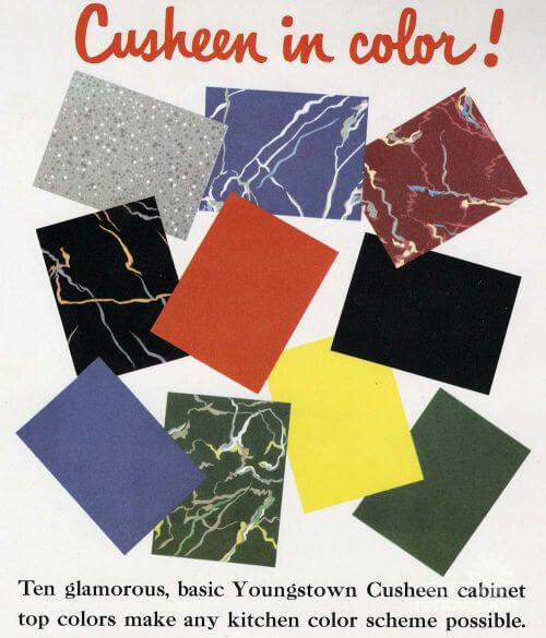
retro counter tops cusheenPoking around my vintage marketing materials last week, I bumped into yet another counter top material used in post-World-War II kitchens. I have a complete Youngstown Kitchen salesman set, and in the presentation binder, Mrs. America got a look at “Cusheen” vinyl counter tops, available in 10 colors. 

cusheen retro kitchen counter topsThere are no dates on my sample set or the presentation flip board that goes with it, but I will estimate this material is circa-1950. When I research vintage counter tops from the 1940s and 1950s, I mostly see reference to linoleum (used in the 1940s and earlier) and then, laminates, which began to grow in popularity after World War II. But vinyl? That’s pretty rare, I believe.

cusheenIn a different 1952 catalog from archive.org, shown above, ”Cusheen” is presented as an alternative linoleum. The text says that Cusheen is a “vinyl cabinet-top material, six laminated layers, bonded to sturdy steel subtops. Available in sizes for all Youngstown Kitchens units.” Warning, dear readers: Who knows what was baked into this stuff? Vintage nastiness such as lead and asbestos can be in the layers of our vintage houses — so be sure to engage with your own properly licensed professional(s) to assess what you have so that you can make informed decisions.

youngstown kitchenInterestingly, there is no mention of laminate in these Youngstown materials. By ’52, laminate would have been coming on strong. I surmise: Youngstown wanted to maximize their profits. They could make money on the counter top only when a homeowner bought their factory-produced counter top — which appears to have been designed specifically to hold the thickness of linoleum or Cusheen. Indeed, Youngstown’s counter tops were beautiful creations — note how the shiny front edge flows right into the counter top and then into the shiny metal backsplash; it appears to me that the counter top steel base could be all one piece?

Youngstown kitchenThese Youngstown Kitchens counter tops also were designed to be modular. You could add to your kitchen piece-by-piece, base cabinet and matching counter top included. Click on the photo above — it will enlarge — and you can better see the metal connector strips joining the different pieces of counter top. This connectibility concept enabled Youngstown to sell cabinets one at a time to thrifty homeowners wary of taking on credit.

Youngstown Cusheen counter top

Above: Readers Brian and Keri restored their vintage Youngstown Kitchen cabinets — they had these old-style counter tops. I wonder if the original material was Cusheen?

Now that I know about Cusheen, I think I have it — or something like it — on a vintage dinette I recently bought at the Re-Store. The top of the dinette has a softer, somewhat cushier feel than laminate… it is not as “tappy”, either. I always wondered about the surface of the dinette. I like it. It is… buttery.

I wonder why Cusheen — and other vinyl counter tops — never made it in the market place.

The post “Cusheen” vinyl counter tops — a 1950s option for Youngstown Kitchens appeared first on Retro Renovation.
Lori paints her tile backsplash, using a vintage McCoy vase as her color inspiration

$
0
0

“…From dour to fun” for less than $100

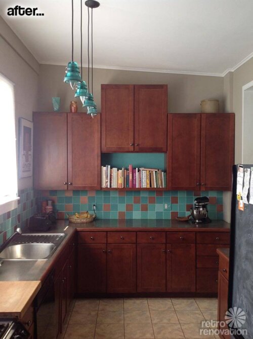
kitchen backsplash-before-and-afterloriReader Lori has been slowly making changes to her 1949 mid-century ranch house since she moved in about a year ago. She was featured in a Retro Design Dilemma asking for ideas for the window treatments in her living room last January. Now, she’s back to return the favor and share her secret for adding color to a tiled kitchen back splash — no hammer or chisel required. Taking her color cues from a treasured vintage McCoy vase, Lori inexpensively changed the color of black ceramic tiles using paint — with great success.

kitchen-beforeLori writes:

Hi Pam and Kate!

I’m a long time lurker, sometimes commenter and have even been a Design Dilemma (pinch pleat curtains)!

I thought maybe your readers would be interested in a cheap DIY that I recently did in my mid-century modern house. I painted our tile back splash from black to turquoise and copper in a random retro pattern. Totally changed the vibe in our kitchen from dour to fun and made our kitchen, which is not retro, fit in with the rest of our retro house. I’m not sure what I spent since I had many of the things I needed but it was under $100.

retro-tile-backsplash

mc coy vase

Lori took her color cues from a treasured McCoy vase

I’m planning on painting the walls. The current paint is what was there when we bought the house. Note the wood trimmed laminate counters. Even though my kitchen isn’t vintage that was one of the vintage laminate counter top edging treatments that was mentioned in one of your articles!

In the after the pendant light shades are made from glass telegraph insulators. They went with the turquoise tiles :-)

Wow, Lori — what a difference some color makes. Bravo to you for coming up with a solution to add some retro flair to your kitchen and “Love the House You’re In!”

How to paint over kitchen back splash tile:

The post Lori paints her tile backsplash, using a vintage McCoy vase as her color inspiration appeared first on Retro Renovation.
Formica 6696-46 Carrara Bianco marble — my new top-favorite marble laminate

$
0
0

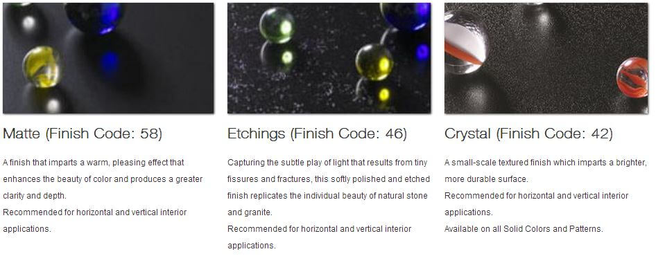
formica-carrara-marble-laminateFormica last month introduced a new Carrara marble laminate — Formica Carrara Bianco 6696-46. Previously, I had identified three places you can find Carrara-style laminate. This Formica design now makes four. Moreover, because of its available #46 etched surface — which mimics fleabite pits you likely would see in the patina of real, aged marble — it now my favorite choice among the Carrara marble laminates on the market today. I asked Formica to send me a large sample, which they did — and I really like the fleabite etching. It looks and feels great — gives the laminate a very natural look. 

Cararra-Bianco-laminate-FormicaI do not know when a marble laminate like this was first introduced to the market. But I do know that most early laminates were designed to mimic other materials — like linoleum. And, by 1969 I know we had Formica White Onyx — which is still available today. Formica’s White Onyx is the oldest pattern in Formica’s range (there are some solid colors that are older, though).

That said, I associate Carrara marble with pre-war kitchens — not post-war kitchens. Doing a 1900s-1930 farmhousy kitchen? Go for it!

For bathrooms, I would probably consider Carrara marble for both pre- and post-war bathrooms, though. I think it would be “okay” in a postwar bathroom because that’s a smaller space.

If I liked the marble look, I would actually prefer a marble laminate in my house — because (1) it would be way cheaper to use laminate than marble… (2) marble is notoriously porous and stains easily, and 3) I don’t like the idea of the environmental degradation caused by mining when laminate would work just as well on a counter top installation, maybe better. When I worked in the sustainability field for a while, I learned the concept of “Material Utilization.” I *think* I learned that, at its heart, sustainable material utilization means using resources — especially finite resources — toward their highest possible cause. I don’t have the data, but my hypothesis is that: Mining marble and granite to use as kitchen and bathroom counter tops is not the best possible use of those finite materials and the energy to process them, when alternatives like 70% paper counter tops (laminate) can do the trick and at a fraction of the cost. Simple ceramic tile also would be wise material utilization for this purpose, I think.

Note: I checked with two of other companies making Carrara marble laminates — neither Wilsonart nor Abet Laminati offer etching like this on their Carrara laminates. I did not check with Arpa; their website is difficult to navigate.

If I were using marble-patternd laminate for a counter top, I would consider doing the fancy post-formed edge that eliminates the visible Kraft paper line. Instead — and especially now that there is this etched Formica Carrara Bianco — I would probably go for it and try to mimic real marble as best I could. This preference is actually counter to the way I’d use other laminates — with other patterns or solids, I’d likely either have a flat edge with the Kraft paper line… or, I’d do a classic postformed edge — just a simple roll… or, I’d edge in steel or aluminum; that is, I would not try to disguise that I was using laminate. With the Carrara marble laminate, however, I just like the idea of faking it, which is possible with postforming technology — not to mention the pitted Formica #46 etching — today.

One final note: Carrara marble — with its closer veining — is the timeless one. The Calacatta marble you see featured in mainstream media a lot today was not commonly used back in the day, as far as I know; it’s a trendy fashionable thing circa 2013. If you want to create a Retro Renovation style kitchen or bathroom, ix-nay the Calacatta, go for the Carrara.

formica finishes

The post Formica 6696-46 Carrara Bianco marble — my new top-favorite marble laminate appeared first on Retro Renovation.
Earthy and colorful 1970s style wall and floor tile — pretty affordable, at Home Depot

$
0
0

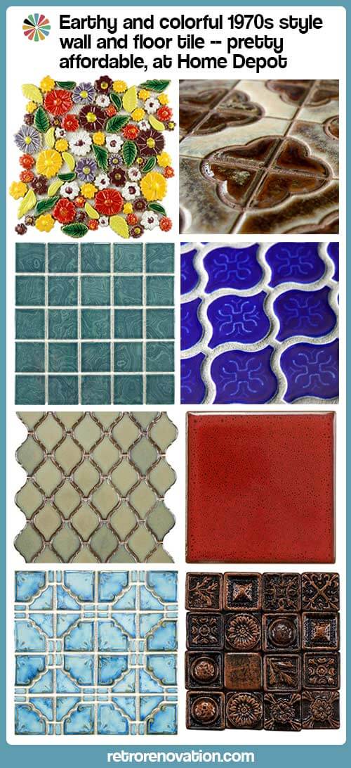
Merola-60s-and-70s-tileWe’ve written about Merola Tile’s great ceramic and porcelain tile offerings for vintage and midcentury bathrooms in the past. Today, more exciting news — Merola Tile has branched out into styles, colors and glaze effects that reflect the groove-tastic late 60s and 1970s. Flower power, vivid square mosaics, arabesque and several other fantastic patterns have joined the lineup. As always, these affordable tiles are available through Home Depot’s website — making it easy for anyone to get their retro bathroom or kitchen groove on.

Photo courtesy of Shoot2Sell Photography.

Photo courtesy of Shoot2Sell Photography.

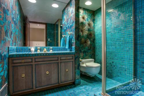
Ever since I saw the gorgeous aqua blue mosaic tile bathroom from the 1967 time capsule house that A. Brandt Ranch Oak built in Forth Worth, Texas, I’ve been thinking it might be nice to add a late 60/70s style tiled bathroom to my home’s unfinished basement — where I am also planning to build a Tiki bar someday. The vivid color and irregular glaze in these tiles really appeal to me, and I think that some of Pam’s love for the 70s has started to rub off on me. That’s why I was super excited to see that the same company that made the University Pink mosaic floor tile that I used in my retro pink bathroom and the light green Metro Hex tile that I’m contemplating using to replace the floor in my vintage mint green bathroom has begun making tiles that speak to this era of decor — in vibrant colors, too!

I contacted Maggie McBride, Communications Specialist for Merola Tile to find out the story behind some of their newest designs.

Maggie writes:

We chose many of these products because we want to be the purveyor of the interesting and unique. When it comes to what’s standard right now, our products are simultaneously eccentric and timeless. We’re a fun company — it’s only fitting that our product lines reflect that, reaching out to others who are interested in making their home as unique as they are. Your choices showcase some intrigue from a range of different time periods and countries, and our selection keeps getting more eclectic and funky!

I also noticed that blue is one of the common colors among the items you listed. We choose a lot of blue because people (including us!) tend to gravitate towards it– it’s soothing, natural, and versatile, accommodating a number of settings and needs. A few of the tiles are standalone pieces that don’t coordinate with another specific series (this is true of the Bouquet Perennial, Modena Cobalt Blue, and Earthen Elements).

Without further ado, here are the back stories to these particular product selections:

Merola-Tile-BouquetPerennial

The Bouquet Perennial evokes an emotional response. It’s totally unique; no one else has it or anything like it, so we’re happy to carry it for that person looking for the perfect retro floral finish in their home.

Merola tile Moderna

John, the president of the company, makes sure we always carry Moderna Cobalt Blue because when he first entered the tile business 30 years ago, it was going out of style, but he absolutely adores the design and associates it with his humble beginnings — and now it’s back in. It’s meant for a swimming pool (forming the 6” border), so it’s durable and impervious.

merola tile palaceMerola-Tile-MoonbeamPacificBlue

The Palace tile has the same origin story, actually — and from its evident popularity, we introduced the Moonbeam series which has a similar feel.

Merola-Tile-BaroqueCopper

The Baroque Square tiles (comes in pewter, brass, and copper) are 16 individual 1” tiles that we sell in packs with the intent to help every customer beautify their home exactly to their taste. They’re very versatile — you can use them to accent square tiles (cut the corners of the larger tiles and insert these), line them up to form a border, or arrange them any way you like.

Merola tile Resort Palm green

The Resort series is a collection of traditional pool tiles that comes in a variety of blues, greens, and even black for added drama. They have kind of a marbleized glaze and you really get the full visual impact when it’s underwater — it gets what’s been described as an “extra wet” effect.

Merola-Tile-OceaniaSquare2Bering Merola-Tile-OceaniaSquare2Marine

The inspiration for adding the Oceania tiles to our program is that it reminded us of 8”x10” pieces sold in the USA back in the early 1980s called Watersplash tiles.  I’m having trouble locating photos, but John advised that World of Tile may have some.

Merola Tile Earthen Elements

Earthen Elements has a 70s appeal — like, 970 AD. (That is not my joke. I wish I could take credit for that.) It’s totally different from anything else we have, which is part of its charm. Another piece on our quest to carry the exotic luxury-grade pieces at an affordable price.

Merola-Tile-EssenceSage Merola-Tile-EssenceScarletMerola-Tile-Essence4InchSand

The entire Essence series is a colorful tribute to 70s decor. The 4×4 inch square tiles are available in few bold colors but also a selection of more subdued, timeless creams and beiges.  The Sea Blue is especially appealing because a truly retro blue can be difficult to find, but this shows the depth and range of bold colors from the time. I didn’t include photos of the Essence Sapphire because we’re working on getting an updated product shot for it.

Merola-Tile-LanternMiniCobalt-tile Merola-Tile-ProvenzaleLanternBlue Merola-Tile-ProvenzaleLanternCotta

The Lanterns are also amazing, as is their range of colors.

Merola-tile-Arabesque-tile-blue Merola-tile-arabesque-tile-green

We also carry a closely-related Arabesque series, which is Moroccan-inspired as well.

Mega thanks to Maggie from Merola Tile for providing us with product shots and information about the company’s fantastic array of late 60s-70s style tiles.

Tips to view slide show: Click on first image… it will enlarge and you can also read my captions… move forward or back via arrows along the photo… you can start or stop at any image:


The post Earthy and colorful 1970s style wall and floor tile — pretty affordable, at Home Depot appeared first on Retro Renovation.

Wilsonart reissues two vintage laminate designs from the 1960s and 1970s — Daisy and Compre — 12 colors

$
0
0

retro laminate patternBig news for retro laminate lovers — Wilsonart has revived two historic patterns from their archives: Compre from the 1960s — and Daisy from the 1970s. These designs come in 12 colorways, including several in original 60s and 70s hues. These retro revival laminate patterns are part of Wilsonart’s enlarged Virtual Design Library, which now contains some 150 unique designs produced via high-resolution digitally printing (vs. made with deco paper) available by special order. Use them for your retro kitchen countertop, bathroom countertop — or even, furniture!

retro laminate patternsDisclosure: Earlier this year I met with Wilsonart to discuss vintage laminates and laminates available today for midcentury style kitchens and bathrooms and ways we might be able to work together to get more vintage-style designs and colorways back on the market. While I was not involved specifically in the rollout of these designs shown today, I saw the original document prints, provided a few suggestions, and encouraged this effort. I continue to work with Wilsonart in this area and if any collaborative projects result, will disclose the blog’s involvement.

Daisy laminate by Wilsonart — reproduction of a 1970s pattern

“Daisy is a design right out of our 1970’s archives. Popular in the early days of laminate, this smallscale graphic design has a random pattern of asterisks scattered on a white background,” Wilsonart says on their website. We sure like the look of this one, and can’t wait until we see the samples on their way to us.

We asked Natalia Smith, design manager at Wilsonart, about the colorways chosen — are they authentic, based on the original designs? She told us via email:

Envy Daisy, Apricot Glow Daisy, and Autumn Lights Daisy are very, very close to the chips in our archives. Tropical Daisy, Field Daisy, and Wintergreen Daisy were inspired by the colors of the 1960’s and 70’s. I actually did a search on Pinterest for fashion of the 60’s and 70’s and some really fun things popped up. Field Daisy was inspired by a crochet dress pattern from the 60’s! Of course, we needed the Ice Daisy to satisfy the group who love black and white. It’s actually interesting to see it in grey scale; it takes on more of the asterisk look than a daisy.

The scale of the pattern — the daisies and the way they are sprinkled about — are also close to the original.

Hey: Click on any of these photos — and they will enlarge on screen, so that you can see more of the detail.

retro laminate pattern

Envy Daisy – pattern of lime, olive and pine asterisks scattered on a white background. Color: Very close to the original design.

retro laminate pattern

Apricot Glow Daisy – pattern of tan, coral, and brick asterisks scattered on a white background. Color: Very close to the original design.

retro laminate pattern

Autumn Lights Daisy – pattern of yellow, orange, and brown asterisks scattered on a white background. Color: Very close to the original design.

retro laminate pattern

Tropical Daisy — pattern of pink, orange and purple asterisks scattered on a white background.

retro laminate pattern

Field Daisy — pattern of yellow, blue, and green asterisks scattered on a white background.

retro laminate pattern

Ice Daisy — pattern of silver, taupe and battleship grey asterisks scattered on a white background.

retro laminate pattern

Wintergreen Daisy – pattern of mint green, aqua blue, and pewter scattered on a white background.

Compre laminate by Wilsonart — reproduction of a 1960s pattern

“Compre are designs right out of our 1960’s archives,” Wilsonart said, “It is a medium-scale retro pattern featuring abstract botanical designs of stylized trees on select backgrounds.”

Regarding the colorways, Smith told us,

In regards to the Compre design, from what we can tell, the design was on an overlay and paired with our solid colors of the time. Think Gold Lame or Glitter. Glitter was an overlay paired with solid color papers. Our Compre designs today are printed which allowed us to get as close as possible to original colors, but not exact. It is very difficult to match a printed color to a solid color paper that is made from a color slurry.

retro laminate pattern

Pink Compre — with a pale pink background.

retro laminate pattern

Cadet Compre – a pale blue-grey background.

retro laminate pattern

White Compre — a white background.

retro laminate pattern

Yellow Compre — a yellow background.

retro laminate pattern

Mint Compre — a pale mint green background.

Full text of our Q&A with Natalia Smith, design manager for Wilsonart:

Q. Are new patterns exact replicas of the originals? 

As close as possible. In the case of Daisy, the scale is the same. In the case of Compre, the scale is slightly smaller.

Q. If not, why did you decide to change the patterns in scale/pattern? 

In both cases, we did not have a lot of original material in order to be completely faithful to the original scale/pattern. We’re talking just chips. We had a lot more Daisy chips which made it a little easier to piece together. With Compre, we have even fewer chips. We were actually quite jazzed with the idea that we were “rewriting” history. We gathered the information we did have, and attempted to create a design that looks authentic.

Q. Are some of the colorways exact replicas? If not, how did you choose the new color ways? 

For some, as close as possible, for the rest we really were inspired by the era and had fun experimenting with color. Envy Daisy, Apricot Glow Daisy, and Autumn Lights Daisy are very, very close to the chips in our archives. Tropical Daisy, Field Daisy, and Wintergreen Daisy were inspired by the colors of the 1960’s and 70’s. I actually did a search on Pinterest for fashion of the 60’s and 70’s and some really fun things popped up. Field Daisy was inspired by a crochet dress pattern from the 60’s! Of course, we needed the Ice Daisy to satisfy the group who love black and white. It’s actually interesting to see it in grey scale; it takes on more of the asterisk look than a daisy.

In regards to the Compre design, from what we can tell, the design was on an overlay and paired with our solid colors of the time. Think Gold Lame or Glitter. Glitter was an overlay paired with solid color papers. Our Compre designs today are printed which allowed us to get as close as possible to original colors, but not exact. It is very difficult to match a printed color to a solid color paper that is made from a color slurry.

Where to order Wilsonart Daisy and Compre vintage design laminate

Anyone can order 8″ x 10″ samples via Wilsonart’s website.

We also wanted to know whether consumers can order laminate directly from Wilsonart. In short — no — but you can order through normal retail channels. Marketing elaborated in response to our question:

I don’t think we can support customers calling us directly to order – at least not at this stage. On the other hand, they’ve always been able to order these products through a designer, a distributor or through the home centers.a consumer can order the VDL designs through Home Depot and Lowe’s.

The complete Wilsonart news release:

Wilsonart Expands Design Library with 150 New Designs
A Whole New World of Pattern is Just a Click Away

TEMPLE, TX (November 4, 2014) – For centuries, designers have searched for more design choices – in fabrics, wallcoverings, furnishings, and no less so, in laminates. Now Wilsonart has an answer – but it’s not on the wallboard, it’s online.

A leading manufacturer of decorative surfaces for more than 50 years, Wilsonart responds to the designers cry for more with 150 new designs, all available as part of a Virtual Design Library (www.wilsonart.com/VDL), an evolving, curated collection of laminates available in just 2-3 weeks from order.

“We’re already used to finding more products, more conveniently online in our personal lives,” said Gwen Petter, director of surface design at Wilsonart. “We thought ‘why not offer that same flexibility and easy access for laminate?’ So we started with a range of designs, some whimsical, some trendy, and some larger scale that really reposition laminate. Our long-range plan is to grow this ‘extended design offering’ to literally thousands of designs.”

The expanded design library was developed with two guiding factors: make it different and make it easy. “We make it different,” says Petter, “by sourcing designs from artists, from trends and even from photographic real life images. We make it easy by doing all the work for you. Unlike “custom” programs, our graphic designers have done all the work ahead of time – the color matching, layout and image adjustment. You get more without having to do more. We think that’s what designers really want.”

By visiting www.Wilsonart.com/VDL designers can access this curated library with patterns ranging from photorealistic imagery such as food and floral patterns to abstract and artistic graphics that subtly set a mood. Think color and bold graphics. Think fun with artistic flair. Those are the themes of the first iteration of designs to join the expanded Wilsonart® Laminate collection.

“It’s like that magical moment when music lovers discovered iTunes,” remarked Natalia Smith, design manager at Wilsonart. “Designers can begin to have access to design selection that will continue to grow and evolve with year-round additions from our design team, as well as emerging artists, illustrators, and designers we’ve sourced from around the globe.”

The first 150 designs fall into 9 themed collections: Geometrics, Folk Art, Retro, Sports, Woodgrains, Youthful, Study Hall, Delectable and Nature. Wilsonart plans to expand the online library with additional collections throughout 2015 and beyond. Many of the curated patterns in this collection are also available in broad colorways, providing even more choice and inspiration.

“Take Geometrics, for example,” says Smith. “They are a great way of adding interest in a trend-savvy way. So much of what we see today is a skillful, yet casual mix of ideas and color. You can have a space where historical, time-worn features form a backdrop for an eclectic mixture of flea market finds and bold pops of large-scale color and pattern.”

Selection is one thing. But what about delivery? Wilsonart’s new offer comes with speedy turn-around on everything – just 2-3 weeks from factory to fabricator. Samples are readily available online at www.wilsonart.com/VDL  or through Wilsonart’s stellar Customer Service Center at 800-433-3222.

Don’t forget, Wilsonart also offers retro boomerangs as part of this collection, which we’ve covered before, too.

This is beyond exciting folks! Kate and I have requested samples already so we can see these fabulous new options in person — we’ll surely be back with more about these fun new patterns!

Link love:

The post Wilsonart reissues two vintage laminate designs from the 1960s and 1970s — Daisy and Compre — 12 colors appeared first on Retro Renovation.
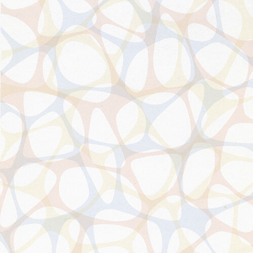
Exclusive sneak peek: Jonathan Adler’s new Formica laminate collection — see the 9 designs

$
0
0

formica-new-retro-laminatesSneak-PeekBreaking news and first on the interwebs, yay: We discovered today that the new Formica® Laminate Jonathan Adler Collection — nine designs in all — was posted on the Formica website in advance of its official introduction scheduled for Jan. 21 at KBIS. AFTERNOON UPDATE: But whoopsydoodle, Formica published the page accidentally, and it was immediately taken down. So, you had like a one hour window to see all the goods. Didja? Meanwhile, because we were cautious about using images from the website that we … guessed … were not supposed to be live yet … Formica’s PR rep sent us some super special sneak-peek images. We are told this is on the only place on the web where you can see all the designs — woot! Brenda Starr reporting. :)

Jonathan Adler designed three patterns — in nine colorways — for Formica

Note: For this special sneak peak we only have the thumbnails, above.

Lacquered Linen:

There are four colorways for Lacquered Linen, the most “useful” of all the designs. Colors are Crème Lacquered Linen, Green Lacquered Linen, Orange Lacquered Linen and Charcoal Lacquered Linen. Likely, they’ll sell a lot of those Creme and Charcoals, but you know us: We are digging that burnt orange and rich avocado big time. Funky and rich retro classiques.

Greek Key:

Greek keys are a signature Adler motif. While we’re not big fans of the pattern — too contemporary for us — we do appreciate the relatively small scale. Colors are Orange Greek Key, Blue Greek Key and Charcoal Greek Key.

And, among all the three new Jonathan Adler designs for Formica we also like that he created (1) tone-on-tone prints and (2) made them multi-directional. That is, the pattern runs both horizontally and vertically in the same measure. Faux butcher block notwithstanding, this is what we like to see in a patterned laminate: Tone-on-tone, multi-directional prints — abstract, ideally, because laminate is a man-made material, it does not need to pretend to be something else.

Malachite:

Okay so maybe these aren’t tone-on-tone, well, not in namby pamby way. We like ‘em. Cuz we like krazy. Colors are Blue Malachite and Charcoal Malachite.

Nicely done, Formica and Jonathan Adler! In particular, we appreciate the COLOR.

Pricing and where to buy:

Formica PR says this will be available to order and purchase at Big Box stores. The designs are rotagravure-printed — this is the method used for mass production. Which means, I will speculate, that these design will be available at a typical retail price — around $100 or less per sheet, similar to other production laminates. If I’m right, that’s great news. Officially, here is Formica’s estimate of retail pricing, installed:

official pricing

Samples:

We presume these will be available after official launch Jan. 21.

Jonathan Adler

Jonathan Adler, photo by Maura McEvoy

More information:

Official launch is not until Jan. 21. Here is info from Formica’s October news release:

Formica Corporation, the inventor of laminate, has partnered with iconic potter, designer, and author Jonathan Adler to create nine bold new designs exclusively for Formica’s 2015 Residential Line. The new laminate patterns will be unveiled at the Kitchen & Bath Industry Show (KBIS) in Las Vegas in January 2015.

The collection will include many of Jonathan’s signature patterns in an array of hues ranging from subtle to bold. Perfect for countertops, accent walls, cabinets and more, each style will reflect Jonathan’s spirit of iirreverent luxury and represents a bold update of a classic material.

“This collection of new designs embodies Jonathan Adler’s design philosophy and we think it will inspire our customers to think differently about their environment in both look and function,” said Amy Gath, vice president of marketing at Formica Corporation. “We anticipate that young homeowners especially will be attracted to these sophisticated yet modern new designs as they look to add a truly unique and personal touch to their space.”

“Formica® Brand laminates are iconic and it has been a dream to include some of my favorite patterns, colors and motifs in the collection. The uses for laminate are limitless; I can’t wait to use the styles from my collection in my stores and design projects-I want to laminate everything in my life with the new line,” said Jonathan Adler.

Jonathan Adler is an internationally recognized design and lifestyle brand offering decorative objects, tabletop collections, bedding, bath accessories, gifts, candles, furniture, rugs, pillows, lighting, fashion accessories and more. The company prides itself on its ability to combine a serious design philosophy with a colorful sense of optimism. Jonathan Adler brings style, craft and joy to your home. To learn more about Jonathan Adler, visit WWW.JONATHANADLER.COM

About Formica Corporation

Founded in 1913, Formica Corporation, part of the Formica Group of companies, is a leader in the design, manufacture and distribution of innovative surfacing products for commercial and residential applications. For more information about Formica Corporation, its products, special programs and promotions, visit www.formica.com or call 1-800-FORMICA™.

About Formica Group

Formica Group globally leads the industry in the design, manufacture and distribution of surfacing materials. Formica Group is a global group of companies consisting of Formica Canada, Inc., Formica Corporation, Formica de Mexico S.A. de C.V., Formica IKI Oy, Formica Limited, Formica S.A., Formica S.A.S., Formica Taiwan Corporation, Formica (Thailand) Co., Ltd., and Formica (Asia) Ltd., among others.

More Jonathan Adler:

four new colors for sinks from kohler and jonathan adlerAbove: Jonathan Adler worked with Kohler in 2012 to introduce several sink colors. I am not sure if these are still available.

Jonathan Adler orange wall sconcehavanna wall sconce Jonathan AdlerJonathan Adler Parker wall sconce

Above: Jonathan Adler has some very pretty lighting in his collection for Lamps Plus. This is a pretty big collection — still available.

Jonathan-Adler-dog-lampAbove: And there was a Jonathan Adler Happy Chic collection for JC Penney in 2013. Not sure of the status of this collection either.


The post Exclusive sneak peek: Jonathan Adler’s new Formica laminate collection — see the 9 designs appeared first on Retro Renovation.

3 midcentury home design products we wish they’d bring back NOW

$
0
0

3-mcm-products-to-bring-back2014 was a great year for reissues of classic midcentury product designs.  Still, there are three very basic products — I’m trying not to be greedy — that I would love to see brought back to the market, mass produced for cost, quality and availability. My list is based on seven years of blogging about midcentury modest and modern homes, hearing about what Retro Renovators need and have been excited about whenever the products come up. 

1. Glitter laminate:

gold sparkle laminateThe absolutely positively #1 item on my list is glitter laminate. Made with deco paper — with real glitter inclusions, just like they were starting around 1950 all the way through the early 2000s — yes, this stuff was available for more than 50 years, non-stop. Today, this deco paper is still available — I have personally seen where it is made! Laminate manufacturers: I won’t even be greedy and ask for different colorways. Just give us a white (check the historic examples to get the rightish white) with gold glitter. The white field glitter laminate will solve for MULTITUDES of Retro Renovator kitchens and bathrooms.

Alas — this neeeeds to be a production laminate — it can’t be digital special-order run.  As far as I know, the metal glitter cannot be replicated with current on-demand digital printers. That means this must be done with paper with real glitter inclusions. Laminate manufacturers must buy minimum (lotsa) size rolls of the deco paper… once they make the laminate, the sheets must be stored flat, in climate-controlled warehouses… and then there’s the whole marketing machine to get it out to the public. Note, I also tend to think that laminates made with deco paper (on a rotogravure press or as in the case of sparkle laminate, with real inclusions) are nicer looking — the ink saturation will be more intense… AND production laminates are much less expensive than on-demand digital prints because they are mass produced.

Pretty please with sprinkles on top: Will some laminate manufacturer take a big gulp and take a market risk on this? We’ll buy it! Maybe there are enough of us!

vintage-Wilsonart-White-gold-satellite

Gold Satellite had crackles in it. Cool. Super cool. But I just show this for a close up of the glitter. If we can have ONE design, just give us plain glitter, sans crackles.

 .
2. Double-bowl, dual-drainboard, metal-rimmed, cast-iron kitchen sink:

vintage-drainboard-sink-kohler-1940s

vintage-drainboard-sink-in-1940s-kohler-kitchenNumber two on my list: A double-sink, double-drainboard, hudee-rimmed, porcelain-on-cast-iron kitchen sink. The photos above show vintage Kohler sinks from our story about 16 vintage Kohler kitchen sinks.

kohler drainboard sink

And above: A 1956 ad for the Kohler “Clearfield” sink — now we know its name. Thanks to ebay seller splittinimagecards for giving us permission to show this photo of this ad for sale, we love having it for our archive.

Note, we love the hudee-rimmed Kohler’s Delafield sink currently available today — it’s a go-to recommendation for a replacement kitchen sink. But oh dear Kohler, can we have a design with drainboards?

Hey, I’d even settle for a double bowl with one drainboard. OR, a single bowl with one or two drainboards. Must have the metal rim, though!

3. Armstrong #5352:

armstrong 5352

armstrong 5352

From a 1963 catalog in my personal collection. Some of the other colorways, which I pretty sure varied over time. Lookie the one with the pink!!!!

Armstrong Floors, can we have #5352 — believed to be the most popular flooring of all time — back, please? Unbelievable: This floor was made from at least 1935 through to the mid-1990s — 60-some years!

This classic rich brick red color would be fine if we can have only one color. But if you can do other colors, how about something light and creamy (predominantly warm, rather than cool)?

armstrong linoleum 5352

Armstrong #5352 started off as an embossed linoleum. We’ve spotted it in catalogs as early as 1935…

Armstrong-5352-linoleum

… As manufacturing techniques and the market changed, the floor was printed on vinyl. We have a reader who worked in the flooring department at Sears and said it was sold there through the mid-1990s.

Note: I am not saying Armstrong #5352 floor should be paired with a glitter-on-white laminate countertop. To me, the brick red screams “put me in a warm cozy midcentury modest kitchen” with a rich-colored countertop. But maybe I’d pair glitter laminate with a light, creamy colorway of the floor.

Updated: Like in Lori’s kitchen, photo below, thanks, Lori! Well, she says that floor originally had green squares, but they’ve faded with use. Still, you get the idea of how a monochrome meet-up between a beige 5352 floor and the glitter laminate could look:

glitter laminate with armstrong 5352 beige

Some historical images from our files:

armstrong linoleum 1935Armstrong 5352 in a bathroom design, 1956

What do you think of my list, readers?
I’m wary of pushing our luck by being *too greedy*…
but for the “next wave” of we-wannas, what else?


The post 3 midcentury home design products we wish they’d bring back NOW appeared first on Retro Renovation.
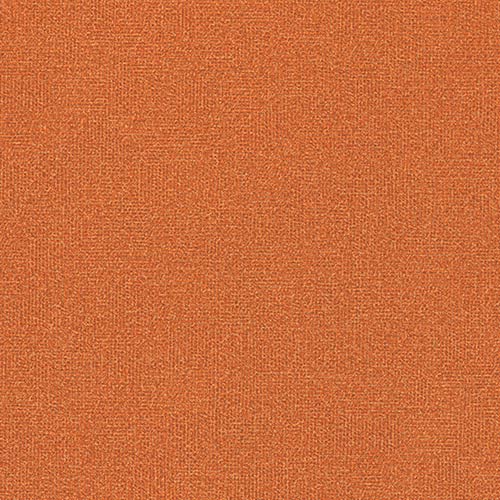
Wilsonart Endora and Betty laminates — two terrific new retro designs for countertops

$
0
0

retro laminate

Photos hot off the presses!

Need new countertops for your midcentury kitchen or bathroom? If so, you might want to hang on until summer, when Wilsonart will introduce two new abstract designs — “Betty” and “Endora” — for sale. Hmmm. With their colorways, scale, and well-designed retro pattern, Wilsonart Betty and Wilsonart Endora skyrocket to the top of my list of  laminates to consider for countertops in a midcentury modern or vintage-style home. (Fingers crossed that I like the colors when I see real samples.) Also good news: These will be standard residential laminates — so the price should be very affordable. 

Tip to view photos: Click on any photo, and it should double in size on your screen, so you can see more detail. Keep clicking anywhere on the enlarged photo, and all the photos in the story should run as a slide show. Hit anywhere off the photo or hit Escape, and you return to the story. This feature should work in all stories here on Retro Renovation.

Wilsonart says these will be available nationwide “this summer.”

Wilsonart’s 4972-38 Betty laminate:

wilsonart-betty-countertop-2

Reader Melanie took this photo at the Builder’s Show in Las Vegas, at the Karran exhibit promoting these sinks meant for laminate countertops. She says the countertop field reads “a dove gray I would say. Really pretty – in fact, the laminate is what drew me to the exhibit.”

retro laminate

Wilsonart says:

Betty is a small to medium scaled abstract pattern overlapping box and square in retro color blend of teal and orange.  The name is indicative of the mid-century names to connect to a moment in time when women named Betty and Endora would work in their very modern kitchens.  This pattern reflects the quirky optimistic quality that reflects that period in time.

retro modern kitchenretro modern kitchenFrom their vignette shown at the recent KBIS show, it looks like the so-called “teal” in this pattern will harmonize quite nicely with aqua cabinetry or accessories. The field looks to be grey (golly, I’d prefer an off white) — but I certainly understand the choice considering the continuing popularity of gray in the contemporary mass market today.

We’ve asked to see samples as soon as we can and will report back as soon as we have them in hand.

Wilsonart’s 4973-38 Endora retro design laminate

retro laminate

So… will the pinks in “Endora” go with all the Mamie Pink tile in millions or American bathrooms?We can’t wait to get a look-see and let you know.

Endora is a small to medium scaled abstract pattern overlapping box and square in retro color of pink and gold.  The name is indicative of the mid-century names to connect to a moment in time when women named Betty and Endora would work in their very modern kitchens.  This pattern reflects the quirky optimistic quality that reflects that period in time.

Formica’s Nassau pattern from the 1960s:

formica laminate nassau patternThe new Wilsonart designs remind me of Formica’s Nassau design introduced in the 1960s (?) Note: I need to check this date. I have it somewhere…

Again, my view on the best laminate designs for a retro kitchen: Tone-on-tone, multidirectional, small-to-medium abstract patterns in colorways that will harmonize with our “real color” interiors. The new Wilsonart Endora and Betty designs look to be a great step in that direction.

The complete new “Stylistic History” collection coming from Wilsonart

There are additional patterns in the Stylistic History collection that includes Endora and Betty. The other designs in the collection are moving to the Residential line from the Contract (Commercial) line or another country in the Wilsonart family:

Stylistic History

“Be yourself; everyone else is already taken.” – Oscar Wilde

Personal styles evolve and change.  These 8 fresh new patterns are an exciting nod to our collective stylistic history.  Baby boomers are searching for those things that feel like simpler, more innocent days, while the millennials incorporate optimism and originality.  Fun patterns, unusual textures and bold colors represent this direction, without being bogged down in the past.  Think individuality, difference and distinction.

These easygoing, aspirational lifestyles are centered on both the meandering road and the techno highway.  Plastic laminate was originally used for its low cost versatility and has grown up to be the perfect material for these unique forms of self-expression.

These bold and whimsical new colors and patterns offer an updated nod to historic and vintage patterns while being firmly rooted in the present.  There would be no denying that these new patterns are anything but.

4942-38 Crisp Linen (Standard)

retro laminate patternA neutral background with crisp white warp and weft “threads”.  Reminiscent of a woven fabric, it has evolved into a compact small pattern that provides texture and highlights.  Crisp Linen is a crossover from the contract line.

4943-38 Classic Linen (Standard)

retro laminate patternA taupe background with lighter taupe warp and weft “threads”.  Reminiscent of a woven fabric, it has evolved into a compact small pattern that provides texture and highlights.  Classic Linen is a crossover from the contract line.

4944-38 Casual Linen (Standard)

retro laminate patternA brown background with lighter brown warp and weft “threads”.  Reminiscent of a woven fabric, it has evolved into a compact small pattern that provides texture and highlights. Casual Linen is a crossover from the contract line.

4962-38 Gesso Tracery (Standard)

retro laminate patternretro laminateThe quatrefoil is a conventionalized representation of a flower with four petals or of a leaf with four leaflets.  The small scale quatrefoil motif is repeated and fades in and out and is rendered in a warm white with hints of grey.  Gesso Tracery is a crossover from the contract line.

4973-38 Endora (Standard)

retro laminateEndora is a small to medium scaled abstract pattern overlapping box and square in retro color of pink and gold.  The name is indicative of the mid-century names to connect to a moment in time when women named Betty and Endora would work in their very modern kitchens.  This pattern reflects the quirky optimistic quality that reflects that period in time.

D502-60 Ocean Matte Finish (Standard)

retro laminate colorThe colors in the mid-century were a reaction that went against what was there before which was very somber, subtler, quieter colors. Colors in the ’50s and ’60s became brighter and stronger — anti-establishment, but optimistic.  Colors were mixed in ways they hadn’t been put together before, such as black, turquoise, and red, a clear example of all the rules being thrown out the window.

This color comes from one of our international sister companies.  Ocean can be found in Polyrey’s collection as E026 Emeraude, as well as in Shanghai’s and Thailand’s collections as 0028 Emerald Sea.

D501-60 Orange Grove Matte Finish (Standard)

retro laminate colorThe colors in the mid-century were a reaction that went against what was there before which was very somber, subtler, quieter colors. Colors in the ’50s and ’60s became brighter and stronger — anti-establishment, but optimistic.  This dynamic orange perfectly reflects that sentiment.

This color comes from one of our international sister companies.  Orange Grove can be found in both Thailand’s and Shanghai’s collections as 0387 Orange.

4972-38 Betty (Standard)

retro laminateBetty is a small to medium scaled abstract pattern overlapping box and square in retro color blend of teal and orange.  The name is indicative of the mid-century names to connect to a moment in time when women named Betty and Endora would work in their very modern kitchens.  This pattern reflects the quirky optimistic quality that reflects that period in time.

The post Wilsonart Endora and Betty laminates — two terrific new retro designs for countertops appeared first on Retro Renovation.

Vintage linen laminates — 12 colors in my collection of 1950s sample chips

$
0
0

linen laminate retroLinen laminates were among the most popular in the 1950s — I will even surmise the most popular choice for kitchen and bathroom countertops. Continuing to fill out our historical archive, I organized my collection of vintage laminate sample ships… pulled out the document linens… and scanned. Today — close ups of 12 colorways of linen laminate — eight from Formica, four from Textolite. Above: Formica Green Linen — which I am betting was the most popular color. This green is perfect for a midcentury kitchen with wood kitchen cabinets. Sigh.

linen laminate retroAbove: Formic Tan Linen laminate. Note the weave of the Formica. It is not too sharp / edgy. My “problem” with the linen laminates on the market today is that they are too pokey-looking — sharp-edged industrial rather than soft-edged domestic.

linen laminate retro

Above: Formica Primrose Linen laminate.

In her thesis — the best most comprehensive history of Formica and its patterns that I know of — materials expert Grace Jeffers (and good friend) says that Linen was one of the first patterns that Formica introduced after World War II. It was instantly popular.

linen laminate retro

Above: Formica Powder Blue Linen laminate.
linen laminate retroAbove: Formica Pink Petal Linen laminate.

Super mega thanks to Robert of ElectraChime for sending me the box of Formica paper samples that this pink chip came from. What a generous contribution to my archives! xoxo

linen laminate retroAbove: Formica Lipstick Red Linen laminate.

linen laminate retro

Above: Formica Gray Linen laminate.

linen laminate retroAbove: Formica Charcoal Linen laminate.

Textolite Linen Laminates:

linen laminate retroAbove: Textolite Daffodil Linen Laminate.

I have only four samples of Textolite linen laminates. It’s hard to tell from such small samples, but it appears the patterns are different — I’d say the Textolite linen weave is less tight… with more chunkies simulating natural irregularities you’d find in a linen thread. I like the Textolite pattern better than the Formica pattern but, seriously, this is splitting hairs. Or threads.

linen laminate retro

Above: Textolite Tan Linen Laminate.

linen laminate retro Above: Textolite Panama Linen Laminate.
linen laminate retro

Above: Textolite Gray Linen laminate.

Six places to find linen look laminates today:

The post Vintage linen laminates — 12 colors in my collection of 1950s sample chips appeared first on Retro Renovation.

Viewing all 61 articles
Browse latest View live